Saturday, December 31, 2011

Happy New Year 2012!

The start of a New Year is here and that means trying new things. It is for this reason that my New Year's card this year have a different look ... not easy for me!

The first card reflects the sticker's black background by extending it with a black textured strip of Canson paper.  My past New Year's cards have often used the representations of champagne bottles as the theme and this image carries on the tradition with a celebratory sticker from Recollections. The feel is retro, down to the glittered multi colored stars.


The second card is my version of the annual countdown. The background paper is actually a Christmas paper from My Mind's Eye.  The 3D glittered stickers of the countdown and clock with text are from Recollections and compliment the paper perfectly.


Happy New Year to all and here's to a great 2012!

Thursday, December 29, 2011

Thank You card.

Some times a patterned paper is so powerful that it seems a shame to try and change it ... so make it your design inspiration!  I did this with a ColorBok paper from an old pad I found on clearance at WalMart.


The background looked not only masculine but somewhat retro as well ... so I expanded on the look by simply enphasizing the concept. The band and the larger squares are cut from matching solid papers and layered in a scatterned pattern to offset the structured background pattern. The text is a stamp from "Hero Arts" stamped in a blue ink to match the darker blue paper.

Friday, December 16, 2011

Another non-traditional Christmas card!

This time I wanted not only the color but the image to be non-traditional: so I chose blue and a heart!

The heart wreath was made using a McGill pine branch hand punch and two different shades of blue paper (in this case I cheated and used QuicKutz adhesive papers).  I added some turquoise colored faux gems (Stampendous Dot Sparklers) and an ivory satin bow (Anna Griffin) to complete the wreath. The text is a glittered rub-on from K&Company/E.K. Success.  The wreath is set on an ivory piece of paer, mounted on a ligt blue paper and then on an ivory card.


Merry Christmas!

Thursday, December 15, 2011

Personal Christmas card.

This year I've made over a hundred Christmas card but none looked quite as good as the one I made for my own use. The card is a simple combination of several stickers that create an elegant look.

I started with a 5" x 5" white card; which I framed with thin antique gold line sticker from "Mrs. Grossman's Design Line" 1/2" from the edges. Using glitter markers from "Martha Stewart/E.K. Success" I embellishes a 3D sticker from "Anna Griffin" before adding the 3D sticker to the card. To finish the look I added some yellow, orange and red mini "Hero Arts" rhinestones over the printed berries in the holly.


Monday, December 5, 2011

Recycled gift tags.

One of my favorite way to make make Christmas cards is to recycle old gift tag. Here are three quick and easy cards I made using recycled gift tags. 

The first two card use 3D glittered gift tags from Punch Studios (which I found at an outlet store for $5.00 for a box of twelve after the season).  For the first card I took off the rectangular backpiece of the tag and then combined the tag with a text sticker from "BoBunny" and a 3D glittered poinsietta sticker from "K&Company/E.K. Success" on a piece of  "K&Company/E.K. Success" paper in combination with a red background and a simple white card.


For the second card I mounted the gift tag on a piece og gold paper and then mounted the panel on a simple white card. I edged both the gift tag and the gold paper woth gold line stickers from "Stampendous", added gold corner stickers (also from "Stampendous") and finishe eveyrthing off with the additions of various shapes and colors of faux gems  from "Stampendous Dot Sparklers".


The third card was made for a friend who likes purple! I found a pack of gift tags for a dollar of a purple and silver tree on a white background surrounded by a purple background. I mounted the gift tag on a white card and edged both the white panel and the purple panels of the tag with silver line metalic paper sticker from "Mrs. Grossman's Design Line". I added a rhinestone star from "Darice" to the top of the tree and various sizes of  purple rhinestones (also from "Darice") as ornaments.  The final touch was a silver rub-on text from "Martha Stewart/E.K. Success".

Sunday, November 27, 2011

Non traditional colors.

I was challenged to make Christmas cards using what I would consider non traditional holiday colors and these are the ones I came up with.

The first card was the hardest because I have a problem combining shades of "pink" so I decided to make the background a solid pink and go from there. The wreath is made using a hand punch (McGill) of a pine branch punched from plain white paper. I drew a circle in pencil and then filled it in with the punched out images until I got a wreath. The pink bow was pre-made (Martha Stewart/E.K. Success) - thank goodness! The text is a rub-on (K&Company/E.K. Success) and the bling are faux pink gem stickers (Stampendous Dot Sparklers).


The second card uses an old die-cut (Sizzix) and three pieces of grey/green coordinating paper (7 Gypsies). I punched out a tree from two of the papers, cut one of them up and then alternated the cut pieces on the one remaining solid tree. The third paper was used for the background and was mounted on a piece of gold paper (The Paper Company), trimmed and then attached to a white card. The text and flourishes on the tree are rub-ons (Martha Stewart/E.K. Success) and the bling are faux gold gem stickers (Stampendous Dot Sparklers).

The third card is made in shades of blue (with a hint of white) using an electronic die-cut machine (Cricut and the Christmas cartridge) for the house, a circle punch for the foliage and some fancy hand cutting for the tree trunk. I haven't decided on a text for this one yet but whatever it is it will be added in the upper right hand area of the card.


I enjoyed trying to find not only non-traditional colors but seasonal themes that would compliment the colors. Definetly something different for me!

Wednesday, November 23, 2011

One more ornament card!

This card uses a 3D gift tag from "Punch Studios" as a base.  The tag actually had one more back rectangular layer; which I removed to highlight the shape of the actual ornament.  The gold lines are "Stampendous" stickers and the scroll work surrounding the ornament are all left over dams and insets of various gold corner stickers from "Stampendous".  The faux ruby gems are also stickers from "Stampendous".  The text is a glittered border from "K&Company/E.K. Success" that I cut up.


Friday, November 18, 2011

Christmas Time ... a little early!

One of my favorite image for Christmas is the "ornament" and I like creating my own "ornaments" for my cards. One of my favorite "ornament" image I use is actually a circular shaped rub-on made for the clear plastic ornaments you can make yourself. To finish off the look I embellish the rub-on "ornament" with stickers.  This year I selected two cozy snowy scenes for my images.

The first one card uses a legal size card (4 3/4" x 11"). The rub-on image (Royal & Langnickel Brush Man.) was added on the center of the lower portion of the card. I then ran a thin gold line (Stampendous) from the top of the card to the top of the rub-on. To add to the "ornament" look I surrounded the top and bottom with some of the rub-on gold rub-on flourishes that came on the same sheet as the ornament, gold flourish stickers (Stampendous) and ruby colored faux gems (Stampendous Dot Sparklers). The text is a sticker (Hallmark) which I picked up in the card department of WalMart.


The second card uses a standard A2 size card (4 1/4" x 5 1/2"). The rub-on image (Royal & Langnickel Brush Man.) was added slightly off center on the lower portion of the card. I again ran a thin gold line (Stampendous) from the top of the card to the top of the rub-on. To add to the "ornament" look I embellished the top and bottom rub-on with gold rub-on flourishes that came on the same sheet as the ornament, with gold flourish seals (Gartner Studios); which I picked up at one of our local office supply store.  The text (Michael's) is a sticker.


These are fun and easy to make ... the best part is that the rub-on scenes are actually pre-glittered!

Friday, November 11, 2011

Thanksgiving Scarecrows.

My favorite images for Thanksgiving besides the turkey are wreaths and scarecrows.  Scarecrows do not need to be scary, on the contrary here are a couple of cute friendly looking scarecrows to celebrate the Holidays.

The first scarecrow is a 3D paper sticker (E.K. Success/Jolee's Boutique) that is framed by branches with seasonal leaves and vegetables.  The frame is a die-cut (Cricut - Home Decor cartridge) while the leaves and vegetables are left over stickers (E.K. Success/Jolee's Boutique).  The text was computer generated and printed on a clear address label (Avery).  I chose a  light brown background to insure that all the other fall colors would pop!


The second scarecrow is a 3D paper sticker (E.K. Success/Jolee's Boutique) that stands against a group of leafless trees while pointing to a pumpkin.  The trees are flat laser cut stickers (E.K. Success/Jolee's Boutique) while the pumpkin is slightly embossed 3D sticker (E.K. Success/Jolee's Boutique).  The text is a sticker (Hallmark/Stickeroni).  For the background I chose a distressed blueish paper (Basic Grey) to simulate a foggy night.


These scarecrows could also be used for Halloween ... they love their work and are only too happy to help out!

Friday, November 4, 2011

Sunflowers

One of my favorite fall flower is the sunflower and I really enjoy using them on cards.  Here are the latest examples.

The first card uses "Sticko/E.K. Success" glittered sunflower stickers on a background created using two "Cricut" cartridges: the "Home Decor" for the green flourishes and the "Elegant Edges" for the tag".  The tag was edged in brown and black ink to match the card; which was covered with a "DCWV" hounds tooth patterned paper.  The text is a rub-on from "Chartpack".


The second card uses "Jolee's Boutique/E.K. Success" 3D vellum sunflower stickers on a background paper from "Brinks Designs".  The paper is actually a 4 1/4" x 5 1/2" card size card stock paper; which I found at a craft show several years ago and bought a hand full of different designs and just color photocopy now.  The text is computer generated and printed on a clear "Avery" address label.  


I kept the cards simple to insure that the beautiful stickers were highlighted and became the focus points.

Thursday, October 27, 2011

Simple hello!

I made this card as a quick "hello" and have received some inquiries as to the techniques, supplies and materials I used for this simple, quick and easy card ... so here goes.


The card is 4 1/4" x 5 1/2" (or type A2) made from textured white paper from "Bazzill Basics".  The patterned strip of paper is from an old "Prima" pad and I used only the portion of the paper that had the brownish/greenish colored flourish and flower background in it.  I edged the patterned paper with gold strips from the "Mrs. Grossman's Design Line" sticker series.  The tag is from an "E.K. Success/K&Company" package from a couple of years ago, that I edged with brown ink to really make it stand out.  The tag is attached to the card with raised adhesive dots.  The text was computer generated and printed on a clear "Avery" address label.  The 3D bird on a branch and the accompanying 3D flowers are stickers from "E.K. Success/Martha Stewart".

As I wrote this I realized that other than the bird on a branch and the accompanying flowers from "E.K. Success/Martha Stewart", all the products are older and more than likely discontinued or as they say in the craft business "retired".  But that doesn't mean the card can't be reproduced with similar newer in stock products.  The challenge is to use what you have!

Saturday, October 22, 2011

Neat new background product!

A friend recently introduced me to a new product that creates incredible backgrounds.  It's called "Goosebumps" textured spray and I get it on-line through "Paper Wishes".  What's neat about this product is that depending how much you spray on and what color inks you choose to smear over it, you can create any look from rock, marble or just textured lumps! 

I was given a sample piece of paper (already sprayed) by my friend to see what I could do with it and after some pondering decided on an oriental theme with a stone looking background.  I started by trimming the paper a little smaller than a standard A2 size card.  I then used several colors of pigment ink from grey to green to gold (Tsukineko and Ink It-up!) to create what reminded me of an old piece of rock.  By using pigment inks it allows you to wipe off excess color and blend the colors together ... just make sure you let the finished product dry well before moving on to the next step. I then stamped the peacock image (Impression Obssession) using "Tsukineko Staz-on Olive Green", masked the image and stamped the bamboo branch with leaves (PSX) across the paper using "Tsukineko Staz-on Cactus Green".  Again I let everything dry thoroughly before moving on and coloring the peacock using a "Crayola" bright green marker.  Before the marker ink dried I wiped some of it off to give the image an aged look.  I mounted the finished stamped panel on a piece of dark green paper and then mounted that panel on a green card.  To finish the card I used an epoxy 3D Chinese coin sticker from "Jolee's Boutique/E.K. Success" wrapped with a piece of "Offray" gold edged ribbon.


I don't usually "brag" about a product but this one is versatile and allows you to create some great effects just by the amount you use and the color inks you select.  Plus depending on the pressure you use when applying the colors and how much you wipe off you can really change the look of the background ... I also did one that looked like leather by using browns and golds.  Try it!

Monday, October 17, 2011

Romantic Halloween #2

I received so many comments on my idea of a "romantic" Halloween card that I just had to make another.


I started with a black card on which I mounted a  piece of texted patterned paper from "K&Company/E.K. Succes" die-cut using the parchment die from "Sizzix" and edged in black ink. I then die-cut one of the many  frames from the Happy Haunting cartridge from "Cricut" out of black paper and textured ivory paper. The 3D roses are again an "Anna Griffin" monochromatic black, grey and white sticker that I lightly colored using chalks. To add that extra layer I added some black tulle behind the roses.  The text is computer generated and printed on a clear "Avery" address label.  Think this one I'll keep and use!

Tuesday, October 11, 2011

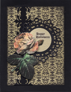
Romantic Halloween

Got a lot of request for details and info for my Romantic Halloween card after I posted it on Face Book ... so here goes.

The background patterned paper is from last year's "Martha Stewart/E.K. Success" Halloween pad; which I edged with black ink before mounting it on a black card.  The vertical band was created by double punching a 1 1/4" wide strip of black paper using an "E.K. Success" edge punch.  The medallion was a white die-cut tag from  "Martha Stewart/E.K. Success" which I turned black using a large "Sharpie" marker.  I then cut a circle from rough ivory textured paper to fit inside the medallion.  The rose is a monochromatic  3D sticker in grey, black and white from "Anna Griffin"; which I lightly colored with pencils.  The text is computer generated and printed on an "Avery" clear address label.

Yes, Halloween can be romantic and even sexy!

Monday, October 10, 2011

Mojo Monday Halloween

When I saw this week's Mojo Monday's sketch I knew I wanted to use it and what better way than for one last Halloween card.

The card is a pre-made "Die-cut With a View" scallop edged card covered with two different patterned papers from last yeaqr's "Martha Stewart/E.K. Success" Halloween pad which I edged in black ink.  The ribbon and medallion are done using the "Martha Stewart/E.K. Success" Iron Gate corner and edge punch.  The greyish colored tag is also from  "Martha Stewart/E.K. Success" but I colored the edges with a black marker to maintain the somber theme.  The pumpkin epoxy sticker is from "Creative Imagination" and the text is a left over rub-on from last year's "Target" Halloween collection.  The twine on top is a self adhesive ribbon from a package called "Markings" from "C.R. Gibbons" which I found at our local pet store last year and includes black and tan seld-adhesive suede strips as well.

Friday, October 7, 2011

Elegant Halloween

I like the sharp contrast of black and white cards but find it very hard to use for an everyday card; however I worked the theme into what I consider to be an elegant Halloween card.  I wanted to create an old fashioned  funerary announcement look for this Halloween card. 

To create the card I started by  black embossing a floral medallion stamp (somewhat funerary in look and feel)  from "Inkadinkado". The medallion was cut out and the cut edge was colored with a black "Sharpie" marker. For the background I used the "CuttleBug' Swiss dot embossing folder to create a soft pattern .  To assemble the card I started by mounting the embossed panel on black paper; which was trimmed and in turn mounted to a white card.  Next I ran an "Offray" 1/2" wide black ribbon vertically down the card 1 1/4" away from the folded edge.  I added the embossed floral medallion using thin raised adhesive dots and a black "Offray" bow.  To finish I added a computer generated text printed on an "Avery" clear address label.

Thursday, October 6, 2011

Masculine and Feminine Blank Cards

I was very surprised at one of my early classes when someone asked me what constituted a masculine card versus a feminine card when it came to color, patterns and subject. I came up with a list for each and recently I used my list to create these two cards.

Masculine:
I stamped a Celtic design from "Just for Fun" with "Ranger Archival" sepia ink on a white shimmering piece of vellum paper; which I trimmed and mounted on a metallic copper paper. I created the ribbon by doubling up with a "Martha Stewart/E.K. Success" edge punch on a 1" wide strip of copper paper. To complete the look I added "Stampendous" orange Dot Sparklers faux gems stickers to the stamped panel.


Feminine
I started by cutting a 1" wide strip of gold Swiss dots on white paper from "The Paper Company", mounting it on a piece of gold paper, trimming that and running it vertically down a pink card 1" away from the folded edge.  I edged the card with pink ink.  The roses are a 3D "Anna Griffin" die-cut; which I put together using different thicknesses raised adhesive dots.  To complete the look I added a pink bow also from "Anna Griffin".

Monday, October 3, 2011

Non traditional Halloween cards!

I wanted to make some cards using stamps with crow or raven images but unfortunately I only had one stamp with crows or ravens... so I improvized.

The first card actually uses the one stamp I had with crows or ravens.  The image is a border of crows or ravens on a branch with a moon outline from "Inkadinkado".  To make the card I started by stamping an image of a frame with a bird and some foliage from "Inkadinkado" in black ink on a starry patterned paper from "Frances Meyer". Next I stamped the border image of crows or ravens on a branch with a moon outline in black ink on either side of the first image to create a continuous design. I trimed the stamped image, mounted it on black paper, trimmed it again and then mounted the stamped strip on a blue card. To complete the card I stamped the text from "Serendipity Stamps" in black ink inside the frame .


The second card uses a stamp of two "love" birds sitting on a tree branch from "Stamp Camp" stamped in black ink on more of the starry patterned paper from "Frances Meyer".  I then stamped a moon and cloud outline stamp from "Beeswax" in black ink over the first stamped image. I aligned the images using a stamp positioner to insure that the moon outline framed the two birds. I trimmed the stamped panel in a square shape and mounted it on black paper; which was trimmed and then mounted on a square white card. To complete the card I stamped the text from "Serendipity Stamps" in black ink.


Using black ink and a dark night scape patterned paper turned ordinary birds into Halloween creatures and made for great Halloween cards!

Monday, September 26, 2011

Beautiful sexy witch!

This is a card from 2006 using a computer free clip art image.  Rarely do you find such a beautiful sexy witch and let's face it: Samantha Stevens proved that witches were and are beautiful sexy creatures.  I mounted the image on orange colored paper and then on black paper.  The corners are Mrs. Grossman's bat stickers.


Unfortunately I wasn't smart enough to actually download the image and save it.  All I did was print it out.  Now years later I can't find it ... should you find it, please let me know!

Friday, September 23, 2011

Old Fashioned Feminine Birthday Cards

Next month two elderly women friends will be celebrating their birthdays.  I love making these types of cards and especially using rose images on them.  Unfortunately once again my favorite images are retired ones ... why have all the good ones been retired? 

The first card is sharp and elegant and uses an old fashioned painterly sticker image from "Penny Black".  The image was given a border frame by mounting it on gold paper. The patterned background paper is from "Anna Griffin" and was framed in gold as well.  The gold lace trim is a sticker from the "Mrs. Grossman's Design Line" (also retired).  The gold text is from "Stampendous".


The second card is more ethereal and uses a 3D sticker from "Anna Griffin" over partially glittered purplish die-cut border from "K&Company/E.K. Success".  The patterned background paper is from one of the many "K&Company/E.K. Success" 5" x 7" mat pads and edged in purple ink.  The text is from "Mrs. Grossman's".  To finish the look I added a thin ribbon and bow in silver from "Offray".


Hopefully these cards will have as long as life as the recipients have had.

Monday, September 19, 2011

Using an Enveloppe Seal for a Blank Masculine Fall Card

Sometimes you just need a season appropriate masculine non-holiday related card for someone special ... what do you do when the card stores are just not there for you?  Easy, use one of your envelope seals and make your own card.  This card combines two layers of papers (one created using a hand punch), one sticker and one seal ... what could be simpler than that.

Start by making a 4 1/4" x 5 1/2" card from ivory paper and to keep the masculine theme going I used a textured paper from "Bazzill Basics".  Cut a 2" wide strip of metallic copper paper, in this case it's from a sheet of bronze tint burnished copper paper by "River wind/Mrs. Grossman's".  Next cut a 1 1/2" wide strip of dark brown paper and punch along both long edges using an "E.K. Success" rope edge punch to create a ribbon like effect.  Adhere the punched paper ribbon to the metallic copper paper.  Add a "Mrs. Grossman's" design line copper sliver line down the middle of the punched ribbon.  Adhere the strips vertically down the card 1/2" from the folded edge.  To complete the card add a "Fossler's" metallic seal to the card and you're done.


I like using seals on my cards because they come in many formats and are usually found in packs at stores that sell stationary at a much smaller cost than regular stickers .  Seals are usually meant to be used on the back of envelopes but I think they work wonders as decorative highlights on cards as well. 

Thursday, September 15, 2011

yet another Look!

In preparing an article on 3D stamping I decided to use the same cottage scene (Inkadinkado) once again and created a third look using one stamp.

Start by stamping the image twice on white paper both time mixing green and brown inks.  I used the green ink for all the pine trees and the brown ink for the bare trees in the background, the cottage and the ground cover in the front.  Color both images using coloring pencils (Prisma Color).  Trim one of the stamped images using a deckle edge scissor (Fiskars), mount on a light olive paper, trim using a deckle edge scissor and add to a white card.  Take the second stamped image and cut out the cottage and the large pine tree in the front.  Attach the cut-outs using raised adhesive dots to their appropriate places on the card.   used two thicknesses of raised adhesive dots to create further depth by having the tree further out in the foreground than the cottage.  To finish the 3D look I pulled apart a cotton ball and attached a string of it to simulate the smoke coming out of the chimney.


I didn't add any text to this card just to keep it simple!

Sunday, September 11, 2011

One stamp .. two Looks!

A stamped image can change in theme simply by changing the ink color with which it's stamped.  A good example is this snowy scene stamp from Inkadinkado/E.K. Success.

For the first card I stamped the image in a mixture of grey and black ink from ColorBox on a white shimmering paper from Canson.  The stamped image and the silver background panel were die-cut and embossed using the Labels Eight dies from Spellbinders.   The card itself is made from a grayish Bazzill Basics paper.  To add some sparkle (not visible in the scan) in used white glitter on the trees, roof top and ground.  To finish the card a simple black rub-on text from K&Company/E.K. Success.  The result is very elegant and sophisticated look.


For the second card I stamped the image in a mixture of green and brown ink from ColorBox on a white shimmering paper from Canson. I accentuated the ink colors by lightly coloring the image with pencils.  The stamped image was cut out using deckle edged scissors and edged in black ink. The card itself is covered with a wood grain patterned paper from K&Company/E.K. Success and edged in brown ink. To add some sparkle (not visible in the scan) in used white glitter on the trees, roof top and ground. The stamped panel was added to the card using mini square brads (Making Memories) in black. To finish the card a red glittered text from K&Company/E.K. Success. The result is very masculine and somewhat country look.


The snowy scene can actually be turned into a spring, summer or even fall scene just by using more shades of green ink and deepening the coloring process of the image.  For the fall look Soft Flowers flocking could be used as well.

Wednesday, September 7, 2011

My first commission piece.

This week-end someone called our local craft store to see if they made or knew anyone who made custom cards for special occasions and the store manager recommended me.  The assignment: a wedding card with a specific theme and text chosen by the client.  After a brief e-mail consultation I was commissioned to create a 5" x 7" card in shades of white and ivory using a wedding cake as the theme, with the stipulation that the card be kept simple and elegant .  This is my creation.


The card itself is made from white pearlized paper from Bazzill Basics.  The background panel, cut using the Elegant Edges Cricut cartridge, is made from pearlized ivory paper with a silver shadow.  The banner was cut twice from white pearlized paper using the Sizzix Banner die, cut apart and then re-assembled to create a 3D effect.  The banner text was computer generated using the Vivaldi font and matches the insert text.  The cake is a 3D paper paper sticker with trimmings of small pearl and miniature 3D glittered ivory and white flowers with pearl centers from K&Company/E.K. Success.  I did alter the sticker a bit by removing the plate on which the cake sat to create, at least for me, a cleaner image.

Monday, September 5, 2011

More Fall Themed Birthday Cards

I came across some items over the week-end that I knew I could use and all were in the dollar bins!  One was a bag of silk fall leaves at WalMart and the others were ruby, gold and pale green rhinestone leaves at Michael's.  Here are the cards I came up with using these finds!

The first card uses the rhinestone leaves with the addition of some small round rhinestones K&Company/E.K. Success for added bling. The flourishes are rub-ons from K&Company/E.K. Success.  The text is a gold sticker from Stampendous that I colored with a black Sharpie marker.  The panel was cut and embossed using the largest Spellbinder Nestabilities Mega Deckle Rectangle die from a tan colored paper.


The second card uses the silk leaves and an old metal frame from Making Memories that I colored using a copper DecoColor marker.  The frame inset paper is actually the backing from a K&Company/E.K. Success fall sticker pack and has a very small scripted text running across it.  The text is a gold sticker from Stampendous that I colored with a black Sharpie marker.  I added small copper details around the leaves using remainders from various copper sticker sheets.

Saturday, September 3, 2011

Dollar store beauties

As we all know we can spend tons of money at the craft store for supplies but what about the good old dollar store? I found these really beautifully detailled 3D glittered flower stickers (some of the flowers even have rhinestone centers) at one of our many local dollar stores! Each sheet of stickers comes with five or six large multi layered flower arrangements and three or four smaller assorted ones. The set I got is more for springtime but still ... for a dollar!

The first card I made used one of the large stickers (the flowers and strawberries in the basket) and then two of the smaller ones (flowering branches). For the background I used the largest and the next to the largest die from the Spellbinder Nestabilities Labels Eighteen set. I die cut the white paper and then edged them in grey.

The second card I made used one of the large stickers (the flowers and cherries in the tea cup) and then two of the smaller ones (the strawberries leaves). For the background I used the CuttleBug Swiss Doe embossing folder on light blue paper and a Martha Stewart/E.K. Success white lace tag.


As I said these are more for springtime so left these cards blank for now.

Wednesday, August 31, 2011

Fall Birthdays

August and September are sort of "holiday-less" months and as such  fewer cards seem to be made or posted, so I decided to make some fall themed birthday cards.  I've had this pad of "Me & my Big Ideas" papers for a while and I thought something in there would fit the occasion and theme perfectly.  I decided on two papers both with white shadows of leaves.

The first card's background is a fall muted color striped paper with white maple leafed branches as an overlay.  In itself the design was beautiful but I wanted to add my own touch to it.  To accomplish this I used some old "Frances Meyer, Inc." leaf and berry stickers; which I added to the paper's branch outline.  The added leaves and berries pick up the muted colors of the stripes to add vibrancy to the card.  The text is a sticker from "Mrs. Grossman's".


The second card  uses white flocked leafed branches and flourishes over a solid background paper.   Again to add my own touch I added gold rub-on leaves from "Chartpack".  To finish the card I added a thin strip of white paper with another "Mrs. Grossman's" birthday sticker and a small rub-on gold leaf.


Sometimes pre-printed paper is so beautiful on it's own that it needs very little to turn it into a stunning card.

Thursday, August 25, 2011

Flower Soft Trees.

A year or so ago I purchased the "Flower Soft" starter kit with a great stamp ... although I used the stamp and I never used the "Flower Soft" product; which resembles a very thick flocking material.  That was until now!  I was looking for something different to do and saw a card that used the "Flower Soft" product as the fallen leaves from a stamped tree scape.  So I thought I'd give it a try.

The first card  uses an Inkadinkado stamp which I stamped on my favorite sky paper (Cosmo Cricket - Chicken Little) in a combination of red and brown ink and then covered in part with the "Flower Soft" material.  I mounted the stamped image on dark brown paper and then on a square ivory card.


The Second card uses a stamped tree from "Stampscapes" again on my favorite sky paper (Cosmo Cricket - Chicken Little) in brown ink and then covered in part with the "Flower Soft" material.  The card was edged with the same brown ink.  The banner was created using a Spellbinder die, edging it with brown ink and then adding a computer generated text.  To add to the overall effect the banner is actually 3D.

Monday, August 22, 2011

Sound Off!

I wanted to take a minute and sound off in response to a letter to the Editor printed in Scrap & Stamp Art magazine.  Without going in details the writer implied that cards without the use of stamping required little talent.  I strongly object to that, as no matter what media is used the card requires the use of a strong sense of design ... which is talent!  Yes, I agree that certain media create a wow factor but that does not mean the card maker does not have to apply their own imagination or TALENT to put the card together.


This card uses pencil coloring, stamping, rub-ons and stickers, all which work individually but when put together do so much better.  The background is created by layering a solid colored paper (American Crafts) over a patterned paper (DCWV).  The edges and corners of the solid colored paper were distressed using a light olive coloring pencil. The nest (E.K. Success/Inkadinkado) was stamped in grey ink and then colored with markers and pencils.  the nest actually has a butterfly instead of a bird perched on it's edge ... I colored the butterfly green to make it look like leaves.  The 3D bird and eggs paper stickers (E.K. Success/K&Company) cover the stamped butterfly and eggs.  The 3D dogwood flowers (E.K. Success/Jolee's Boutique) cover the stamped flowers.  The rub-on text (E.K. Success/K&Company)  was chosen not only for what it says but also for it's color (green) and the associated flourishes.  I created my own matching flourishes on the opposite side of the nest using coloring pencils.

Yes the stamped nest contained eggs, flowers and a butterfly instead of a bird and I could have stamped a similar looking text.  To me that would have been a very flat and dull looking card compared to this 3D multi medium gem.

Saturday, August 20, 2011

Birthday Wreath

This card uses some of the most delicate laser cut and 3D assembly stickers I have.


The banner, wreath and flowered vines are  3D laser cut stickers from Stickopotamus while the laser cut text is from Mrs. Grossman's.  The laser cut text actually comes in white and can be colored, in this case I used a metallic copper color marker to match the frame within the wreath.  The card background is a patterned paper from the Die Cut with a View Old World stack, edged in brown ink.  I have to say that the scan does not do justice to the intricacy of the wreath and vines.

Tuesday, August 16, 2011

Re-used images.

Over the years I've amassed a huge collection of antique cards and images that I periodically use on my cards.  One of my all time favorite image is from an old postcard and one I've used on many cards.  The best part is that it even comes with a location for added text or personalization.  By changing the newspaper headline as I see fit the card goes from "thinking of you" to "get well" to "another birthday makes the news". 


I keep the original card in a glasine envelope and each time I want to use it I color photocopy the original  on the highest quality setting the copier has.  Depending on the look I want to create I copy it  either on standard white paper or photo paper.  Depending on your copier, you can also scan an image and then play around with size and color.  Simple but effective way to re-use a favorite image.

Monday, August 15, 2011

1973 Flashback!

While doing some chores I always play music ... this time it was the '70's.  Halfway through the CD Tony Orlando and Dawn's "Tie a Yellow Ribbon Around the Old Oak Tree" came on.  It made me wonder, whatever happened to the concept of yellow ribbons (which by the way started the concept for all the other colored ribbons) for our service men and women?  So I decided to make a card to honor that old tradition in hopes it will start again!


The background is paper from K&Company/E.K. Success from one of military packs.  The tree is from a set of stickers I found at Joann"s Fabrics and is also from K&Company/E.K. Success.  The yellow ribbon is from a pack containing a variety of different colored ribbons which I also found at Joann's Fabrics.   I folded into a bow to create the bow using a mini adhesive dot.
Personally to me this simple card says a lot ... let's bring back the yellow ribbons and let our troops know we want them to come home!

Friday, August 12, 2011

Cards for Sale!

I've been given the opportunity to try and sell some cards in a consignment store.  I wanted these cards to be clean, simple and very professional looking but with that defenite homemade look.  Here are three of the new cards that I thought would be worthy of selling!

The first card is an any gender birthday card using a "Picture Show" stamp embossed in copper on tan paper edged in copper ink and colored in pencil and highlighted with some ruby red "Stampendous Dot Sparklers".   The stamped panel is mounted on a metallic copper from "The Paper Company" which in turn is mounted on a white card over an antique gold "Offray" ribbon.  The text is a rub-on from "Die Cut with a View".


The second card is a masculine birthday card for those golfer's in your life.  The 3D golf club crest and banner stickers are from "K&Company/E.K. Success" which I found in the clearance bin at one of our local craft stores.  I mounted these on alternating layers of brown and green solid colored papers from one of the fall color pads from "Die Cut with a View".  The text is from "Mrs. Grossman's".


The third card is a sentiment card made up of various die-cut images.  The parchment background and the banner are done using "Sizzix" dies (cutting each one out twice, cutting one apart and then re-assembling them into 3D images) that were edged in brown ink before mounting on the card.  The flower bouquet is a pre-made die-cut from "K&Company/E. K. Success"; which I stretched by cutting the stem portion off the main bouquet and then attaching it lower on the card and hiding the disjointed connection with the banner.  The text is computer generated and printed on a clear address label from "Avery".  I mounted the die-cut images on a light olive green textured background paper from "K&Company/E. K. Success" to pick up the coloring of the leaves.