Wednesday, April 17, 2013

Printed acetate frame overlays.

Spring sale at the local craft store led me to make some unexpected purchases ... a box of pre-made dies which also included printed acetate overlays. The smaller acetates were usable but the rest were frames. The ones in the box I got fit well centered on a 5"x 6 1/2" card but were just a slightly too big for the 4 1/4" x 5 1/2" cards I usually make. My first reaction was to chuck the frame overlays (after all I only paid $1.00 for the entire package) but then I took a second look at them.
 
 
The first card is a 5"x 6 1/2" that I made for Easter. I used two of the acetate overlays full size over one another as the background. The overall background of the one had a slight greenish tint to it; which I emphasized by mounting them on a light green background paper before mounting them on a white card. I added flower stickers in the upper left and lower right corners to finish the frame effect.
 
 
The second card is a 4 1/4" x 5 1/2" and required the acetate frame to be cut apart and re-assembled. I chose to only frame portions of the card leaving the upper right corner empty. The card was scanned and the edge of the acetate shows up much more than it does on the actual card. I added a 3D glittered sticker to add interest and depth to the overall image. The final touch was a pre-made texted tag. The acetates I used are lightly glittered; which add another level of depth to the card.

Sunday, March 31, 2013

Easter - a fall mistake!

 Last fall I was playing around with some of my stamps with various images of trees. One of the result was made using an Inkadinkado/E.K. Success stamp; which I stamped next to each other twice in brown ink on a piece of sky patterned paper (Cosmo Cricket Chicken Little). The bottom part of the stamp is actually a solid background with leaves silhouettes. The end result was not what I had expected and seemed to have no real life.  I put the stamped image aside. Fast forward to this Easter. For some reason the stamped image looked better but better yet I knew what to do to it to fix it.
 
 
I started by covering the lower part of the image with a Merlot ink pad (Colorbox) and even lightly went over the ground line into the trees. I then highlighted the background by padding on some yellow and sky blue ink (Colorbox) over the yellow and blue in the sky. Next I trimmed the panel down to size and edged it with more Merlot ink. The next step was the rub-on text (Chartpack) from some texted sheets from 2005; which I recently found at the bottom of a drawer and thought had gone bad. The final step, mounting the stamped panel on a size 2A card made from shimmering white paper (Bazzil Bassics).
 
This one is for Cora Jean ... thank you for stopping by!
 

Sunday, March 17, 2013

Masculine Album

A couple of weeks ago I posted a card on face Book that had no flowers and received so many comments about my "missing" masculine cards that I just had to respond to by making some masculine cards. Here are the results.

Card 1: Having just seen the new movie about Oz, I could resist using this stamp from Michael's dollar bin. The background is a retired die-cut from Sizzix cut from a Paper Company piece of mustard parchment paper edged with brown and black ink. I colored the stamp image using Prisma Coloring Pencils and then added some brown floss held in place with a glittered Fleur de Lis sticker from Jolee's Boutique/E.K. Success.


Card 2: I stamped a group of horses from Inkadinkado in Martha Stewart/E.K. Succes Merlot ink on a piece Paper Company mustard parchment paper which I then tore the top of and edged with brown ink. I layered a wood grained paper from K & Company/E.K. Success and the torn panel on a card and edged the entire card with more brown ink. The ribbon is made from self adhesive 7 Gypsies paper ribbon and an antique copped buckle from Making memories.


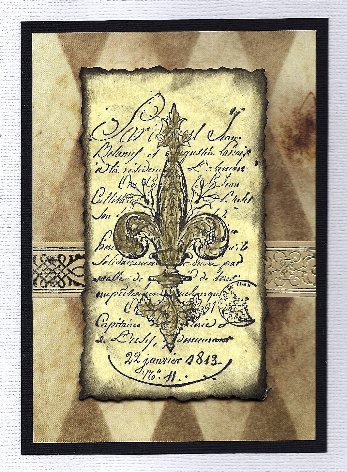
Card 3:   This card is semi monochromatic and uses a layer of patterned paper with a Christmas paper ribbon from Anna Griffin mounted on a black background. The front panel is more Paper Company  parchment paper but this time its the tan version on which I stamped the Fleur de Lis image from Stampers Anonymous. I used a deckle edged scissor to cut the panel and then edged it with black ink before I added it to the card using raised adhesive dots.


Card 4: This last card was the quickest and easiest ... a deep burgundy background on which I ran a burgundy ribbon from American Crafts and then added a gold Spellbinder die-cut frame inlaid with some texted paper from K&Company/E.K. Success. To finish off the card another piece of ribbon cut with a birds beak detail and attached using with a glittered Fleur de Lis sticker from Jolee's Boutique/E.K. Success.

Saturday, March 9, 2013

Easter

This year I decided to break down my Easter cards into adult and children categories. I used cutesy baby chick and bunny stickers for the kids and more religious themed images for the adults. But when I started doing more old fashioned styled cards I realized they could actually fit both categories.


This card uses a Martha Stewart.E. K. Success border punch to create an oval shaped doily ribbon for the background stripe. I overlaid this with an oval lace edged tag also from Martha Stewart/E. K. Success. The image is a sticker from Punch Studios. I used a baby blue card to match the color of the egg in the sticker. Another simple multi recipient card.

Saturday, February 9, 2013

Left overs ... who knew!

This card was made using left over pieces from three different sticker and rub-on packages from K & Company/E.K. Success.


The card was actually inspired by my seeing two of the packages stacked over each other.  I always take my K & Company/E.K. Success packages apart because I save the patterned paper backing material.  This leaves the stickers and the rub-ons on their clear plastic support sheet.  Once I use the pieces that prompted me to buy the package, I keep the remainders in a storage box ... stacked over each other.  There you have it, my inspiration.  I started with a white size A2 card to which I added a 2" wide light purple panel.  I then overlaid 3D texted and framed mini panels in a collage format copied directly from the packaging.  To this I added some rub-on flourishes to enhance the upper and lower corners. To create the shape I cut up the rub-ons and then assembled them to meet my needs.  For the final touch to the lay-out I added some additional 3D flowers with small rhinestone centers and to finish the card I added a computer generated text.
 
Sometimes the unexpected can produce great results.