Sunday, July 6, 2014

Mrs. Grosman's Card

I recently entered a contest to celebrate the 35th anniversary of the Mrs. Grossman's Company and came in 2nd. The theme of the contest was "sticker art" and of course art is what ever you want to make it. For my art, I chose to make a card using ten different layers of stickers from Mrs. Grossman's  from the past 35 years.  


 If you want to see the other winners go to the Mrs. Grossman's website ... it's well worth it!

Stamped backgrounds

I've been trying to stay away from buying pre-printed background paper and trying to create my own backgrounds to highlight stickers. Using stamps to do this is allows you to use complimentary colors and is actually very easy. Here are two quick examples:

The first card took some practice. I started by making a mask using a Spellbinder die from a thin sheet of white paper. With the mask in place on a pre-cut panel of white paper, I colored the inside opening with gold ink (Tsukineko).  Without removing the mask I stamped the text (Stampin Up!) in dark brown ink (Color Box/Clear Snap) over the gold background. I mounted the stamped panel on a piece of antique gold paper (The Paper Company) and mounted the two panels on a white card. The final item is the addition of my last 3D butterfly sticker (Mark Richard); which I've held onto for over ten years.


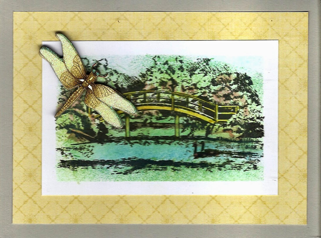
The second card was actually simpler to make. I wanted to create a "water" themed background for a 3D dragon fly glittered cardboard sticker (K&Company/EK Success) that I had left over. I started with a panel of white paper cut to the size I wanted and which I then edged with masking tape. Inside the taped area I stamped the park scene (Inkadinkado/EK Success) image in black archival ink (Ranger) and then using cotton swaps and various ink pads I colored the stamped image, making sure I extended the color over the tape. Once I removed the tape I had a perfect background. I mounted the stamped panel on a piece of patterned paper; which was actually part of the packaging for one of the many K&Company/EK Success sticker packages I've collected. Mounted the two on a light grey card and then added the dragon fly. 


Thursday, June 12, 2014

Father's Day

Masculine cards are hard to make only because there are so few products out there that reflect masculine images ... unless you want to use tired cliches. I always try to find images that would make me stop and look ... not easy. So here are three cards I made using different media to try and celebrate our masculine side for Father's Day.

The first was made using the Art Deco Cricut cartridge and the Art Deco embossing folders from CuttleBug. The background (which inspired the card) was made using the CuttleBug Art Deco embossing folder and then coloring the embossed image with gold ink.The car was made using the Cricut cartridge and has five layers. I made the body of the car beige to match the golden background but that is the beauty of this  card ... the car can be made any color even the recipients favorite color!


The second card is a stamped card with a die cut frame background. I die cut the background using the Spellbinders Fleur de Lys die from a light brown paper. I then masked the interior portion and colored the fanciful edge details with a darker brown ink. On a white piece of paper, using all Stamp it Up stamps, I stamped in black the corner tree, the deer and then over stamped everything with a distress background. I cut the stamped panel down to fit inside the frame and lightly colored the background with chalk.


The last card was made Sizzix and Spellbinders dies to create a regal coat of arms with a very modern monochromatic masculine flair. The background is made using the parchment Sizzix and a textured tan paper which I edged with two shades of brown and then lightly with black ink to create a burned look. The next layer is made using Spellbinders Fancy Tags, cut from white paper and edged again with two shades of brown and then lightly with black ink. The next layer is made using the Spellbinders heraldry die and a metallic copper paper. This layer I also embossed. The final layer is the tattered banner made using the Sizzix die by the same name.


These cards are masculine and can be used for any occasion depending on the text used.

Saturday, May 10, 2014

New Baby Cards

The challenges submitted by magazines are always fun and help me get out of my standards. The July issue of Scrap & Stamp Arts was looking for "new baby" cards and I submitted two both with the same theme" the stork and texted paper that fit the image.

The first first was a square card using embossed K&Company/E.K. Success embossed paper. The stickers are from Sandylion. I chose a neutral color scheme so the card could be used for either a baby boy or girl.


The second card uses Me & my Big Ideas paper ... which I carefully laid out to get the text in the right place. The sticker is from Jolee's Boutique/E.K. Success. Because of the color of the hat and the text of the sticker, I decided to make this a boy's card and continue the blue theme.


Sunday, April 20, 2014

Another Spellbinder layered card - this one for Spring!

When I wanted to create a multi layered card for Spring, I looked through my Spellbinders and settled on one of the Fancy Floral Oval sets as well as a sprig die. 


I started with a 4 1/4" x 5 1/2" textured white card. I then die cut the two floral frames from the same white textured paper and edged each with dark pink ink from Colorbox. Next I die cut the sprig from a light olive paper - to make it easier to adhere I actually lined the paper with a self-adhesive sheet before I ran it through the die cut machine. Next I die cut a floral flourish using the Home Decor cartridge from Cricut from the same white paper and colored it lightly with pastel green ink also from Colorbox. Then  started to layer things up. To finish the card I punched out some small flowers using a Michael's punch; which I colored lightly with same ink as the floral frames. Before I added the flowers to the card, I used the punched stars from the floral frames, which I colored deep red, as the center of the punched flowers.