Monday, July 25, 2011

Delicate Die-cutting.

My latest cartridge from "Cricut" is called Ornamental Iron #2 and I have to say it has some very impressive detailed designs.  The problem is that some of the designs are so detailed and lace like that they are hard to cut on a small scale like the one needed for cards.  To make the pattern for a 5" square card I needed two die-cut designs at 2" (allowing for the shadow background and overall framing) and to get two cut-outs that could actually be used I ended up having to cut out five of them!  But I think the results are well worth it.  Of course i couldn't leave well enough alone and added a small 3D glittered and jewelled "K&Company/E.K. Success" flower to the center.


The look of this card is feminine because of the color choice of white and ecru but it could easily become a masculine looking card by using a darker color scheme or one that actually mimics ornamental iron fencing or detailing. 

Wednesday, July 20, 2011

Another Cricut embellished card.

Here's are two more Cricut embellished cards; which could easily have been done totally using the Cricut if I'd have the patience of cutting out the flowers in various sizes, assembling them and the glittering the center.  Instead I used pre-made Martha Stewart/E.K. Success 3D glittered flowers.  Why not, I may as well use them since I paid for them just like I paid for the Cricut.

The first card was  made using the Picturesque cartridge card and seal feature.  The problem is that you need to use a 12" x 24" mat as well as a piece of paper bigger than 12" x 12" to make a 4 1/4" x 5 1/2" card.  The card created by the Cricut is actually a three fold card; which is not truly required.  So after eliminating one of the panels from the equation it took a while but I figured out how to use a 12" x 12" sheet and even a 6" x 12" piece of paper to make the 4 1/4" x 5 1/2" card.   I cut out the fence motif card from white card stock and added the light blue background on the inside of the card.   The flourishes I used for the stems and tendrils come from the Home Decor cartridge.  To create the opposite look I die-cut the image twice, once using the flip option (or you can just flip the paper over and cut both of them in the same direction).  The last touch was adding the punched leaves (Martha Stewart/E.K. Success rose leaf hand punch) and the 3D glittered flowers.


The second card was made using the Heritage cartridge. The fence and gate are made by combining two corners and one tag options of the same design.  The trees are also from the Heritage cartridge and were cut once from a light olive and once from a darker olive colored paper.  The trees were then cut in half vertically to create four usable pieces.  The banner is from the Indie cartridge and was cut out from ivory colored paper.  The rhinestone centered flowers are from Jolee's Boutique.


I have to admit these two cards are the best cards I made using the Cricut and have inspired me to create more.

Monday, July 18, 2011

Embellishing Cricut designs.

When one spends $300 for a die-cut machine and then $90 a cartridge one expects this to be the end to all ends, at least in the world of crafting. People expect to make cards and scrapbook pages using only the Cricut system and although I am not saying it can't be done ... it just isn't my style. So I struggled and sought ways to best use my Cricut without having to buy too many cartridges. I discovered that for my style the Cricut was best used to create backgrounds for stickers or other embellishments and not to be used to create a full card. So I concentrate on purchasing cartridges that offer a variety of images that can be used for various themes versus specific thematic cartridges. My favorite cartridges are: Home Decor, Elegant Edges and Fancy Labels.  To illustrate my Cricut style, I made the following three cards.
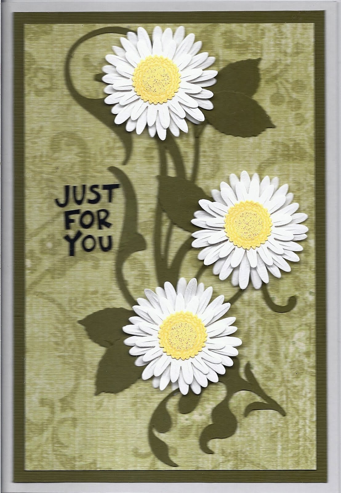
Card one: Just for You!
This card was made using flourishes from the Home Decor cartridge, embellished with leaves made using the rose leaf Martha Stewart/E.K. Success hand punch.  The use of the flourishes as the stems and tendrils just seemed to be the perfect background for the added leaves and flowers. The 3D paper daisy stickers are from Reminisce. The sticker text is from Mrs. Grossman's Card Greetings. 

Card two: Celebrate!
This card uses the Fancy Labels for the background medallion, shadow outline and leafy wreath. Again the 3D paper sun flowers stickers are from Reminisce and the sticker text is from Mrs. Grossman's Card Greetings. I matched the shadow outline color to the color of the sun flowers to tie the images together and again embellished the leafy wreath with leaves made using the rose leaf Martha Stewart/E.K. Success hand punch. To finish off the medallion I edged the inside panel with brown ink.


I'm sure had I had the appropriate cartridges, as well as the inclination and time, I could have made the leaves and flowers for both cards using the Cricut.

Card three: Happy Birthday
I wanted to make at least one masculine card and use embellishments that were totally different from stickers for this card. I chose a Tim Holtz label holder in black and copper tones as the embellishment around which the card would be based. I quickly found the appropriate background on the Elegant Edges cartridge. I die-cut the actual image from a metallic copper paper from The Paper Company and the shadow/background from a solid black paper. I then cut a 3/4" wide strip of black paper to create a ribbon. The card was made from some K&Company/E.K. Success paper edged with black ink. The sticker text is from Mrs. Grossman's.

Saturday, July 16, 2011

Oriental retro?

I'd seen these stickers before but didn't want to fork over the money, especially since I was never really sure on how to use them.  Then came the sidewalk clearance sale and they were marked down to 50 cent! So I got them along with a couple of other similar packs and because I couldn't figure out what to do with them they were filed away and sat there for quite a while. Then rummaging through my supplies I came upon these  stickers again and for some reason an idea came to me - oriental retro!


I made a background card with Bazzill Basics green to match one of the stickers colors and added various width of self adhesive strips white mulberry paper from Generations; which were then laid out on the left side of the card without rhyme or reason. The Sticko/E.K. Success round stickers were then staggered over the white lines in two sets of three, with each set containing one sticker in each color. The text is a computer generated one printed on clear Avery address labels.

Tuesday, July 12, 2011

Memories....

This card is composed of my favorite stamp (Make an Impression), favorite text (Fiskars) and patterned paper (Cosmo Cricket - Chicken Little) but unfortunately all are discontinued or to be polite "retired" products. '


The card is made using a textured tan paper from Bazzill Basics edged with black ink.  The stamped image was also done in black ink on the patterned patterned and then trimmed.  The epoxy sticker text was mounted on ivory paper, trimmed and then added to the card.  To complete the look I added the scrolls rub-ons from American Crafts.

Monday, July 11, 2011

Monochromatic Schemes.

Sometimes when I pull out my papers or my stickers I wonder what possessed me to buy a certain one.  That was the case with this wonderful patterned paper and these brown/warm toned 3D flower stickers that I've had for a couple of years and just never did anything with either of them.  I found inspiration while using some other stickers and papers.

The first card turned out the inspiration piece.  I started with the blue and cream patterned paper from Anna Griffin and then went looking for a matching sticker.  the love birds were perfect, especially since the blue color was repeated.  The rest was just layering various blue and cream papers.  The addition of the Mrs. Grossman's sticker text finished the card of beautifully.


The second card was the challenge but it quickly came together once I started on it.  Both the patterned paper from Generations and the 3D flower stickers from K & Company had the burned sienna color tone to them and although I knew they would be perfect for each other, I just wasn't sure were to start.  Once I framed the patterned paper on a burned sienna piece of paper from Die Cut with a View everything just fell in place.  U cut up the 3D flower sticker; which I then re-arranged over the flower pattern of the paper making sure the tendrils and flourishes remained visible.  A simple computer generated text finished off the card.


The single color theme is one of my favorite and I believe these two cards are perfect example of monochromatic color schemes that are anything but bland.

Sunday, July 10, 2011

Humourous Masculine Card ....?

When I saw this old K&Company sticker I knew just what to do with it and thought it would be perfect for a humourous masculine themed card.  So far not everyone has agreed with me ... as a matter of fact no one finds this card as funny as I do. What do you think?


What could be funnier than a golfer saying "missing you"?

Thursday, July 7, 2011

Masculine Thank You's.

Sometime a simple card can say a lot.  I made these two masculine thank you cards for Operation Write Home and I hope they fit the bill.

The first uses a bunch of "mail' related stickers (I have had for years and have no clue as to made them) to create a central image on which I simply added a text sticker.  I used a craft paper for the card to simulate packaging material and to tie in with the "mail" theme.


The second uses various gift wrapping paper from Papyrus to create a travel theme.  The first is a tweed; which I mounted on a dark brown paper and added two button stickers to create the look of a sleeve.  The second is that of an ancient map, that I cut with a deckle edge scissor.  Again I added a text sticker and  used craft paper for the card to tie in with the "travel" theme.

Monday, July 4, 2011

Masculine collage!

This card incorporates every media you can think of.  the card is made from deep burgundy paper from Die Cut with a View.  The patterned background is paper from Die Cut with a View with pencil colored flourish outlines and edged in burgundy ink.  The central image is created using two stamps:  the parchment from Third Coast Rubber Stamps and a Venitian scene from Stampin Up! stamped in Ranger archival Sepia ink on a marble background paper from The Paper Company.  The parchment corners were double stamped, cut out and adhered with raised ahdesive dots to create a 3D effect.  The fancy floourish corner is from Inkadinkado.  The tag is die-cut from burgundy paper using the Spellbinders Fancy Labels set.  The background copper edged tag is a sticker from K&Company/E.K. Success; which was topped with a die-cut circle from gold mirrored paper from The Paper Company with a rub-on texted message and flower from American Crafts.


Although I purposefully omitted glitter and bling the card being for men ... did I miss media?

Saturday, July 2, 2011

Masculine Cards using Spellbinders

During my frenzy of making cards using the various Spellbinders dies I realized I had overlooked making masculine cards ... so I decided to remedy the situations with the following two cards.

The first card is very formal and has a "British" style to it due to the glittered paisley patterned paper from Die Cut with a View that I chose for the background.  The stripe across the card is the lower portion of the background paper; which I cut out and then relocated.  The panels are made using a metallic copper paper from The Paper Company and the  largest of the Spellbinders Shapeabilities Label Four die and an ivory paper from Die Cut with a View and the second to the largest Spellbinders Shapeabilities Label Four die.  On the ivory panel I stamped a horse scene from Stamp Camp using Ranger Archival Sepia colored ink; which I then colored with pencils.  The text is a rub-on from American Crafts.


The second card is somewhat less formal and is almost childlike.  The concept was to create a crest to congratulate someone for "something".  The card is covered with a vertical ice blue diamond patterned paper from Die Cut with a View and edged with an ice blue ink from Tsukineko.  The background panels is cut and embossed tan shimmering paper from Bazzill Basics.  The actual shield and the wreath are a Tim Holtz die from Sizzix.  The shield was cut from a shimmering light blue paper from Bazzill Basics and more diamond patterned paper and then edged with ice blue ink.  The banners are done using shimmering white paper from Canson with the Spellbinders Fancy Labels die and then edged in gold ink from Tsukineko.  The crown is actually the inset or throw away part of one of the Spellbinders Fancy Labels Three cut out from a scrap piece of The Paper Company's antique gold paper.  To finish the card I used silver/pewter rub-on flowers and Fleur-de-Lis on the shield from Autumn Leaves, a black colored sticker text from Stampendous and turquoise faux gems also from Stampendous.