Wednesday, November 26, 2014

Variation on a Theme - Thanksgiving Style

Once again I decided to make three cards using the same theme but a different medium for each.For Thanksgiving I liked the idea of wheat shafts - something to do with bread and food and being thankful I guess or just maybe my catholic upbringing. I wanted to keep each card simple and clean. 

Card #1:
This card was made using an Inkadinkado image stamped in brown ink from Staz-on on a burlap patterned paper from K&Company/EK Success. The card was edged with the same brown ink. I added a simple tag (also edged with brown ink) for the computer generated text. To finish the card of I added some black brads from Making Memories in the corners.


Card #2:
This card was made using a 3D sticker from Jolees' Boutique/EK Success mounted on two strips of solid color paper (the colors were chosen to reflect the sticker colors) embossed with a Swiss dot pattern from Darice. The tag is made using the Tim Holtz/Sizzix tattered banner dies and again holds a computer generated text.


Card #3:
The final card was made using the Spellbinders Cattail die (to me they look like shafts of wheat) that was mounted over a circle punch on a panel die cut with the Sizzix parchment die (retired but one of my favorites). The cattail die cut was colored using brown ink. The background paper is a lightly mottled paper from K&Company/EK Success and also edged with brown ink. Again the text is computer generated.


These are simple cards and even though the die cut is supposed to represent cattails, when you use your imagination you can do anything!

Sunday, October 26, 2014

Simple Halloween Cards

Sometimes, especially when we are busy, we need to go back to easy ... and what better time than Halloween. Here are some "easy" card ideas that are simple to make and can be adapted to almost any media .. I happened to use stickers for two of them and stamps for the third ... but can also be added to by creating some of the pre-made items used yourselves.

The first card was made using pre-embossed black Swiss dot paper for the card but you can use an embossing folder to create the same look. The strip of text-ed paper is just that, a strip of pre-made text-ed paper from Die Cut with a View, but again you can create your own using a rubber stamp. The strip was edged and lightly colored with black ink. The glittered rat sticker is from Martha Stewart/EK Success. The text are individual black glittered letters from Sticko/EK Success.


The second card use a strip of black paper in which I punched three holes and then added a small glittered sticker in each one (all from one $1.99 pack of Sandylion stickers). Can't get any easier than that!


The third card uses a single tree scene stamp (Picture Show) that was colored using watercolors - just make sure you use permanent black ink for the stamping to prevent bleeding of the paint and ink. The text is a rub-on from the dollar bin at Target. Everything was edged with black ink and the black frame around the image was done using a Sharpie marker.


Monday, September 1, 2014

Variations on a theme.

Last Christmas I decided to use a deer and tree theme for my personal cards. I made the cards using an  electronic die cut machine system that uses cartridges to create the various deer images from glittered papers. After posting some of the cards, I was very surprised and somewhat disappointed at the number of comments I received about the fact that I used an expensive machine that many crafters don't have or can't afford in this economy. The truth is that it’s not the media that’s important but the idea! The original deer and tree theme can easily be duplicated in a variety of ways without having an expensive die cut machine … it’s all about imagination! To prove my point here are some examples of holiday deer themed cards. All the cards start with a basic size 2A (4¼” x 5½”) white card.

Sticker Version
Although the original card was made using silver glittered paper, the sticker version uses two colored Sticko/E.K. Success stickers; which I overlaid on a light blue metallic strip of paper from The Paper Company. The text is from an A.C. Moore sticker sheet. The use of color makes this card, I believe, a little more masculine.


Rubber Stamp Version #1
For the first rubber stamped card I used a couple of Inkadinkado/E.K. Success winter scenery stamps side by side. To create the silver glittered effect of the original card I embossed the stamped images with silver embossing powder from Ranger. For the background I again used a piece of light blue metallic strip of paper from The Paper Company. The text is computer generated.


Rubber Stamp Version #2
So far the deer images have been small … so for the second rubber stamped card I used a Stampin Up! Single deer stamp. To create a ground line under the stamped deer I used an embossing pen. Again I embossed the stamped image with silver embossing powder from Ranger. For the background I used a piece of dark blue metallic paper from The Paper Company; which was the mounted a slightly larger piece of silver paper, also from The Paper Company. The text is from an A.C. Moore sticker sheet.


Die cut Version Version #1

These days many companies make dies and these are certainly a lot less expensive than electronic die-cutting systems. The deer family was die-cut using a Memory Box die from mirrored silver paper from The Paper Company, to continue the glittered effect. I mounted the die-cut image using raised adhesive dots and then framed it with silver sliver Design Line stickers from Mrs. Grossman’s. The star is a Hallmark sticker.


Die cut Version Version #2
The original idea was to show how motifs could be recreated … so I decided for the final card to recreate the sticker deer card using die-cut images. The deer family and background pine trees were die-cut from white paper using Memory Box dies. I colored the die-cut images Upper portions only) using Color Box Cat’s Eyes ink pads. The die-cut images were overlaid on a blue background. The text is computer generated.


So, next time you look at a card, don’t think about what you don’t have … think about what you do have!

Sunday, July 6, 2014

Mrs. Grosman's Card

I recently entered a contest to celebrate the 35th anniversary of the Mrs. Grossman's Company and came in 2nd. The theme of the contest was "sticker art" and of course art is what ever you want to make it. For my art, I chose to make a card using ten different layers of stickers from Mrs. Grossman's  from the past 35 years.  


 If you want to see the other winners go to the Mrs. Grossman's website ... it's well worth it!

Stamped backgrounds

I've been trying to stay away from buying pre-printed background paper and trying to create my own backgrounds to highlight stickers. Using stamps to do this is allows you to use complimentary colors and is actually very easy. Here are two quick examples:

The first card took some practice. I started by making a mask using a Spellbinder die from a thin sheet of white paper. With the mask in place on a pre-cut panel of white paper, I colored the inside opening with gold ink (Tsukineko).  Without removing the mask I stamped the text (Stampin Up!) in dark brown ink (Color Box/Clear Snap) over the gold background. I mounted the stamped panel on a piece of antique gold paper (The Paper Company) and mounted the two panels on a white card. The final item is the addition of my last 3D butterfly sticker (Mark Richard); which I've held onto for over ten years.


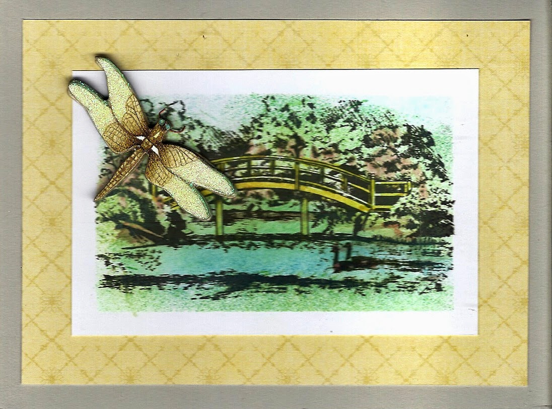
The second card was actually simpler to make. I wanted to create a "water" themed background for a 3D dragon fly glittered cardboard sticker (K&Company/EK Success) that I had left over. I started with a panel of white paper cut to the size I wanted and which I then edged with masking tape. Inside the taped area I stamped the park scene (Inkadinkado/EK Success) image in black archival ink (Ranger) and then using cotton swaps and various ink pads I colored the stamped image, making sure I extended the color over the tape. Once I removed the tape I had a perfect background. I mounted the stamped panel on a piece of patterned paper; which was actually part of the packaging for one of the many K&Company/EK Success sticker packages I've collected. Mounted the two on a light grey card and then added the dragon fly. 


Thursday, June 12, 2014

Father's Day

Masculine cards are hard to make only because there are so few products out there that reflect masculine images ... unless you want to use tired cliches. I always try to find images that would make me stop and look ... not easy. So here are three cards I made using different media to try and celebrate our masculine side for Father's Day.

The first was made using the Art Deco Cricut cartridge and the Art Deco embossing folders from CuttleBug. The background (which inspired the card) was made using the CuttleBug Art Deco embossing folder and then coloring the embossed image with gold ink.The car was made using the Cricut cartridge and has five layers. I made the body of the car beige to match the golden background but that is the beauty of this  card ... the car can be made any color even the recipients favorite color!


The second card is a stamped card with a die cut frame background. I die cut the background using the Spellbinders Fleur de Lys die from a light brown paper. I then masked the interior portion and colored the fanciful edge details with a darker brown ink. On a white piece of paper, using all Stamp it Up stamps, I stamped in black the corner tree, the deer and then over stamped everything with a distress background. I cut the stamped panel down to fit inside the frame and lightly colored the background with chalk.


The last card was made Sizzix and Spellbinders dies to create a regal coat of arms with a very modern monochromatic masculine flair. The background is made using the parchment Sizzix and a textured tan paper which I edged with two shades of brown and then lightly with black ink to create a burned look. The next layer is made using Spellbinders Fancy Tags, cut from white paper and edged again with two shades of brown and then lightly with black ink. The next layer is made using the Spellbinders heraldry die and a metallic copper paper. This layer I also embossed. The final layer is the tattered banner made using the Sizzix die by the same name.


These cards are masculine and can be used for any occasion depending on the text used.

Saturday, May 10, 2014

New Baby Cards

The challenges submitted by magazines are always fun and help me get out of my standards. The July issue of Scrap & Stamp Arts was looking for "new baby" cards and I submitted two both with the same theme" the stork and texted paper that fit the image.

The first first was a square card using embossed K&Company/E.K. Success embossed paper. The stickers are from Sandylion. I chose a neutral color scheme so the card could be used for either a baby boy or girl.


The second card uses Me & my Big Ideas paper ... which I carefully laid out to get the text in the right place. The sticker is from Jolee's Boutique/E.K. Success. Because of the color of the hat and the text of the sticker, I decided to make this a boy's card and continue the blue theme.


Sunday, April 20, 2014

Another Spellbinder layered card - this one for Spring!

When I wanted to create a multi layered card for Spring, I looked through my Spellbinders and settled on one of the Fancy Floral Oval sets as well as a sprig die. 


I started with a 4 1/4" x 5 1/2" textured white card. I then die cut the two floral frames from the same white textured paper and edged each with dark pink ink from Colorbox. Next I die cut the sprig from a light olive paper - to make it easier to adhere I actually lined the paper with a self-adhesive sheet before I ran it through the die cut machine. Next I die cut a floral flourish using the Home Decor cartridge from Cricut from the same white paper and colored it lightly with pastel green ink also from Colorbox. Then  started to layer things up. To finish the card I punched out some small flowers using a Michael's punch; which I colored lightly with same ink as the floral frames. Before I added the flowers to the card, I used the punched stars from the floral frames, which I colored deep red, as the center of the punched flowers.  

Sunday, March 30, 2014

Multi layered Spellbinders card.

Lately I've been playing with my Spellbinders dies; which I do by die cutting a variety of shapes in different sizes and then seeing how I can assemble them into some sort of cohesive looking stack. This card has a total of nine layers (including the base card). Besides using the dies to cut, I also used them to emboss to add yet another dimensional feel.


First layer: size A2 (4 1/4" x 5 1/2") white base card.
Second layer: rectangular frame. I made the 1/4" wide frame using the largest and next to largest rectangle dies.
Third layer: upper and lower decorative scroll work. The scrolls are the ends of one of the Fancy Labels, which I cut in half and separated to create the needed length.
Fourth layer: left and right decorative scroll work. The scrolls are the ends of another one of the Fancy Labels, this one extended just side from side to side and needed no cutting to adjust the length.
Fifth layer: large background panel.
Sixth layer: inner decorative scroll work. These are actually the left overs from another one of the Fancy Labels.
Seventh layer: smaller background panel.
Eighth layer: scalloped circle.
Ninth layer: small inner circle.

I colored or edged each panel before adding it to the card to help highlight the individual layers and also because i wanted to keep the card as flat as possible, I did not use raised adhesive dots

Saturday, March 15, 2014

Making your own layered stamp image.

Now that I'm trying not to buy new craft supplies, I've started to look twice at everything I want or like to see if I can somehow recreate the product or look without having to spend money. I recently saw a set of Tim Holtz stamps while on-line window shopping that I taught where really great. The stamps were a collage type image and ran around $10.00 each on Amazon and $14.99 in  craft stores. I was sure I could duplicate the general theme for no money! So I went through my stamps and got started.. The stamp on the left is the original Tim Holtz stamp (copied from an online add) and the one on the right is my version.


I started with a script design stamp from Stampin Up for the background. Then using three Inkadinkado stamps I created the central bouquet. Using another Inkadinkado stamp I added the flowered border in the upper left and lower right corners. To finish the image I inked the various areas to mimic the original. The only image I could not or did not duplicate was the butterfly. The layer stamping is quite simple, somewhat time consuming but eventually very satisfying ... especially since it saved me money and opened my eyes to what I can do.

Spellbinders layering.

I have quite a few sets of Spellbinders dies, some of which I've used in the past but many I have just thought about using. I decided to start die cutting away and then playing around with what I had die cut to see what I could come up with. I tried to stay pretty monochromatic to  ensure that they blended.

This masculine style card is made using two sets of dies: radiant rectangles and fancy tags.


To start with I die cut and emboss the two center dies from the radiant rectangle set from a piece of ivory paper. The larger background panel I edged with tan ink and the smaller inner panel I edged with Merlot ink (both from Martha Stewart/E.K. Success). Next I die cut two tags from brown paper.To make the card I started with a size A2 white card and centered the largest panel on the card. Then I cut the two tags into twp pieces and layered the pieces as shown over the back panel. I then added the small center panel using a raised adhesive dot. To finish off the card I added a few gold colored dots.

Friday, March 7, 2014

New stamping techniques ... at least for me!

I have so many stamps and use so few! I have so many Spellbinder dies and use so few! What to do? Hey how about mixing the two! The easy way would be to stamp then die cut ... but of course I had to go about it differently. I decided to  die cut first to create a stencil/mask and then stamp inside the inside of the stencil.
Here's what I came up with. The two cards are basically done the exact same way ... just different colors and different embellishments. 

Each time I started with one of the mid size the Spellbinder Labels die and cut out the design in the center of a small piece of copy paper. I  overlaid the stencil/mask on a white piece of paper and then stamped the text (Stampin Up! French script). Then using the same ink color as the stamp, I edged the stamped text before removing the stencil/mask. For one card I cut down the stamped panel and mounted it on matching color paper, for the other I trimmed the stamped panel with a deckle scissor (Fiskars) and edge the new panel with a contrasting but coordinating color.


The stamped background panels become a basic background patterned paper ... the embellishments are what finish the cards. The best part is that the stencils/masks are re-usable and the die cut inset can be used in the opposite way in future cards.


Monday, January 20, 2014

Multi-media Easter card.

I like to mix and match my media as I create my cards; which is what I did for this card.


I started with a stamped image from E.K. Success/Inkadinkado of a bible with a sprig of flowers. I used water color paint to carefully color the image, including metallic gold paint for the page edges. Then using a Spellbinder die cut set, I cut out the stamped image and a matching mat. These I attached to a size A2 white card. As I looked at the painted sprig of flowers, it just didn't seem bright and expressive enough. So I covered it with an E.K. Success/K&Company 3D glittered flower sticker; which luckily matched the mat color. To finish off the card I added a sticker text from Mark Richards.

Saturday, January 11, 2014

Mrs. Grossman's Campaign.

As many of you know I have a long standing love affair with Mrs. Grossman's stickers. Over the years I have amassed a huge collection of her stickers and have recently been asked to be part of their team by creating cards using their latest stickers to be posted as inspiration on their Face book and web site. That's great ... but what about the stickers that have been retired? Those are some of my favorites, especially the Design Line and the laser cut ones. These are no longer available (except in one place) and as my supplies starts to dwindle I've decided to start a one man campaign to convince Mrs. Grossman's to re-issue some of these incredible classics. To  make my point I've been making cards and sending them in to Mrs. Grossman's. Here are some examples ... from the super simple to the multi-layered.

The first one is made with four stickers: a teddy bear, a small red heart, a single red rose and a laser cut text colored in red using a marker.What makes this card special is the laser cut text. These script type texts were cut from a white paper but can easily be colored with markers or ink pads.


The second one is made up of three Christmas wreath released on different years embellished with small sticker bows and a text sticker. The one wreath is rather large and to make the most of it I cut so I could spread it over the card.


The final one was made a couple of years ago using the Design Line Lace edge, which I used to trim the card and mitered the corners. I also use a Laser cut lace heart as the background for a rub-on glittered heart.


I plan on making more cards and posting them in as many places as I can ... who knows many it will work!

Corner punch frenzy!

There are many types of hand punches out there and one of the latest  is the edge and corner sets from E.K. Success/Martha Stewart. The corner punches can be used by themselves to create interesting small medallion.  Start with a stack of 2" x 2", 2 1/4' x 2 1/4' or 2 1/2" x 2 1/2" squares pieces of solid colored paper and then punch away.  Once you've done punching start stacking them into different combinations. I turned mine into "fake" medals by adding some paper trim, bows and bling.