Tuesday, February 28, 2012

Mojo Monday #230

While working on my "Oldie Moldie Monday" card I decided to also do a card for Mojo Monday this week and here it is.


I opted for the square version  of the card as it is more masculine lookingg ... once I changed the flowers and scallops to something more appropriate as well. The background is a chocolate brown paper (Die Cut with a View) with a band of beige paper (Die Cut with a View) that was edged with a rope punch (E.K. Success) on one side and a copper line (StarForm) on the other. The image  was cut out from a full 12" x 12" paper (Graphics 45),and edged with a thinner version of the copper line used on the band. Instead of flowers I opted for copper colored flourishes.

This card can serve for any masculine occasion based upon the text selected. I chose to leave it blank for Mojo Monday.

Monday, February 27, 2012

Thank You - antique feminine style.

It has been a while since I've made this type of card and I must say I'm very happy with this one.


The card starts out with a 5 1/2" x 5 1/2" ivory card. This is layered with a background created from a 5" x 5" antique gold panel from "The Paper Company" layered with a 4 1/2" x 4 1/2" panel of pastel pink damask paper from "Anna Griffin". These panels are framed with gold filigree corners and then edged with thin gold lines both from "Stampendous Class-a-Peal". The filigree corners are highlighted with faux red gems from "Stampendous Dpt Sparklers". Next use the largest die from the "Spellbinders Label 1" series to die-cut a piece of antique gold paper and attached it to the center of the card. using permanent sepia colored ink from "Ranger Archival" stamp the grapevine heart wreath from "PSX" on marbled paper from "The Paper Company" and color it with Pearlescent watercolors from "Yasutomo". Die cut the finished stamped image using the next to the largest die from the "Spellbinders Label 1" series and adhere the panel to the center of the card. Cut the sticker text from Mrs. Grossman's captions in two pieces and add it at the bottom of the grapevine heart wreath.

The results are a beautiful antique looking card worthy of any woman.

Saturday, February 25, 2012

Layered collage.

Here's another card that although being different for me is really a combination of layers of familiar products.


The card started with a 4 1/4" x 5 1/2" white card unto which I added my first layer: a die-cut label from "K&Company/E.K. Success. The entire card was then edged with walnut colored ink from "Ink It-up!".  The second layer was the addition of a glittered copper colored ribbon from "American Crafts".  The third layer are the die-cut leaves made from shimmering green paper from "Bazzil Basics" with a "Sizzix" die; which I cut apart and then spread out to create a background for the glittered 3D flowers (the fourth layer) also from "K&Company/E.K. Success". I started by adding teh large central flower and then cutting a smaler flower in half and tucking in the pieces on either side of the larger flower. I then went back with a metallic green marker from "Prang" and drew in the center vein on each leaf  to add some depth. I should also add that the leaves are not all glued down, some are slightly bent forward and shaped to create a more realistic outline. The fifth and final layer is the small sticker text from "Mrs. Grossman's".

Monday, February 20, 2012

Mojo Monday #229

Another what I would call "manly" looking sketch was offered today for Mojo Monday and here's my take on it!


The card is a 4 1/4" x 5 1/2" dark brown paper with five vertical boards made from a wood patterned paper from "K&Company/E.K. Success" on which I added small black circles to simulate nail heads at the top and bottom of each of the boards. The inset panel is made up of a piece of  "Colorbok" paper edged with Chestnut Roan Color Box Fluid Chalk Ink from "Clearsnap" around which I wrapped a piece of self adhesive suede from "Gartner" and a small copper buckle from "Oriental Trading Co." The trees are part of an edge sticker from "Sandylion" and the deer is from "Jolee's Boutique/E.K. Success". The text is from "All My Memories - Leather Accents Series".

Friday, February 17, 2012

Another multi media card.

I really got into the multi media card idea and for this card I decided to throw in some stamping.

The card started as a 4 1/4" x 5 1/2" white card that I covered with a scrap piece of texted paper (Gartner Studios) that I edged with olive ink (Color Box Autumn Pastels). This was followed by a 1" wide strip of light olive green paper (Bazzill Basics) on which I stamped a flourish border (Fiskars) in olive ink. Using the leaf punch outs from a floral edge punch (Fiskars) done in gold paper (The Paper Company) I created small groupings of leaves over which I added die-cut flowers (Jolee's Boutique). For the background behind the text (Stampendous Gold sticker) I used a pre-made tag (Martha Stewart/E.K. Success) overlaid with an die-cut oval (Spellbinders) from ivory colored paper to match the flowers.

Thursday, February 16, 2012

Something Different!

I wanted to use as many of my favorite products and techniques to make a different (at least for me) collage type card.


The card starts with a 4 1/4" x 5 1/2" white card (. The frame was made from a 3 1/2" x 3 1/2" square piece of metallic copper paper (The Paper Company) from which I cut out an opening in the center using the middle of the labels 4 series die (Spellbinders). I then embossed the frame with a swirl embossing folder (Cuttle Bug) and to finish the frame I inked the raised portions with a copper metallic ink pad (Ink It-up!). The background in the frame is a scrap piece of patterned paper from the Old World pad (Die Cut With a View). The finished frame was added to the lower right corner of the card. Next I die-cut a stem with leaves (Cricut - Home Decor cartridge) from a piece of olive green paper (Bazzill Basics) and added it to the left side of the frame and card. Next I added two bouquets and a single flower from a pack of 3D foiled with rhinestoned centers stickers (Dollar Store - no manufacturer). To add some depth I punched out five leaves (Martha Stewart/E.K. Success) from a darker olive paper (Bazzill Basics) and added them around the flowers. To finish the card I added two different text stickers (Sticko/E.K. Success).

Tuesday, February 14, 2012

Operation Write Home Sketch #108

This is my card reflecting sketch #108 for OWH ... although my dimensions are a little off the general design, idea and concept of the original sketch are all there.


The flowers are all from K&Company/E.K. Success and the text is a silver colored sticker from Stampendous; which I colored copper with a Deca Color marker to match the copper colored lines from Mrs. Grossman's along the edges of the central band.

Happy Valentine's Day 2012

This card was made using two of my favorite sticker manufacturers: Mrs. Grossmans' and Martha Stewart. The card is a simple 4 1/4" x 5 1/2" white card that I framed 1/8" from the edges with a thin red line from the Mrs. Grossman's Design Lines series. The background heart is the Grapevine Wreath from Mrs. Grossman's Paper Whispers series. The 3D glittered heart wreath and bird are from the new Valentine stickers from Martha Stewart, as is the small heart at the bottom of the wreath. The text; which I cut apart and rearranged,  is from Mrs. Grossman's, as is the bow; which is made from vellum pastel ribbons from Mrs. Grossman's .


Unfortunately all the Mrs. Grossman's sticker used are all retired although all are still available at Gentle Creations on line. Happy Valentine's Day!

Monday, February 13, 2012

Generic blank cards.

I am a strong believer in always being prepared and that is one reason I always keep several generic blank cards on hands. Here are a couple that I made over the week-end.

I wanted to have a spring like feel to the first card and yet be able to use for any occasion during the season. I started by selecting some beautiful 3D glittered magnolia blossoms and birds from "K&Company/E.K. Success". The blue lines in the blossoms directed me to complete the card using various blue tones.  The background is a glittered patterned paper from the "Die Cut with a View" Linen pad; which I mounted on a metallic blue paper from "The Paper Company". I also used a white tag from "Martha Stewart/E.K. Success" which I framed by coloring the embossed detail with a thin blue "Sharpie" marker.


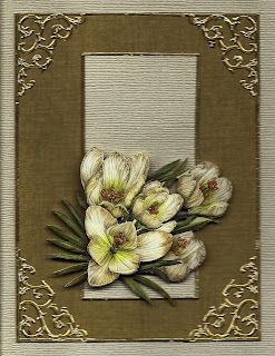
For the second card I wanted something that was a little more inspirational and could again serve several occasions, including Easter. Again I started with a 3D glittered sticker from "K&Company/E.K. Success" but this time I selected a batch of crocuses. The background paper is a lightly patterned tan paper from one of the many "K&Company/E.K. Success" pads on the market; which I edged with gold lines and filigree corners from "Star Form". To create a text area I added a shimmering white piece of paper (again edged with gold lines) in the center of the card and then added the flowers to the lower portion of the white panel to leave room for a future text.


These cards can easily become birthday cards, get well cards and even Mother's or Easter Day cards based on the text added.

Friday, February 10, 2012

Valentine's Day 2012!

I've been making so many cards for OWH that I almost forgot to make my own personal Valentine's Day cards. Since I like ornaments, how about an ornament for Valentine's Day!


The fancy flourished heart is a glitterd rub-on from "Royal & Langnickel Brush Man." I located the rub-on heart on the lower portion of the card slightly off center and then using a fine point red "Sharpie" marker I drew a line from the top of the heart to the top of the card. I then added a sticker text from "Sticko/E.K. Success". To finish off the look I drew a squiggle line and added a small glittered pink heart from "Mrs. Grossman's" to the red marker line just above the large heart.

Wednesday, February 8, 2012

One more bird themed card!

Sometime I can't leave well enough alone. I was looking to make another card and came across one more bird sticker and I just had to use it.


The card background is a piece of "Prima" paper; which I edged in brown ink. The die-cut tag is from "K&Company/E.K. Success". The flowers and bird are 3D foiled and rhinestone stickers which I found at a dollar store - so there is no manufacturer orther than "Made in China". The text is a gols sticker from "Stampendous" that I colored black with a "Sharpie" marker.

Thursday, February 2, 2012

Bird Themed cards!

A friend of mine by the name of Cathy Bowman Russell periodically sends me surprise packages and the last one included a sheet of "K&Company/E.K. Success" birds stickers. Then this week I found yet another "K&Company/E.K. Success" sticker sheet with birds. The signs were all there, I needed to make "bird themed" cards. I made three.

The first card uses the newest sheet of "K&Company/E.K. Success" stickers from which I selected a highly detailed 3D cardboard sticker of a flamingo. The background paper is from a 5"x7" pad of "K&Company/E.K. Success" paper; which I edged with bright green sliver lines from "Mrs. Grossmans". The oval was cut and embossed using the "Spellbinder" oval dies from an ivory textured paper from "Bazzil Basics"; which I edged with brown, red and black inks from "Martha Stewart/E.K. Success". The text is a gold sticker from "Stampendous" that I colored using a red/brown marker from "Sharpie".


The second card uses a flat paper sticker with an epoxy pigeon from the same sheet of "K&Company/E.K. Success" stickers that I used for the first card. I managed to find an almost perfect match for the background paper from a "Prisma" pad. I covered the card with the "Prisma" paper, added the sticker and then edged the entire card with grey ink from "Making Memories". The tag was cut using the "Spellbinders" Fancy Labels set from antique gold paper and ivory paper for the inset. The ribbon is from "Offrays" and is actually the back side (the other side is orange). The text was computer generated.


The third card was made using my friend's supplied stickers. The embossed paper sticker from "K&Company/E.K. Success" was on a yellowish paper; which I trimmed as well as I could from the actual peacock image.  To compensate for the parts that I could not trim off I used a pale yellow card made from "Bazzil Basics" paper and edged with grey and olive green ink from "Tsukineko". From the same sheet of stickers I cut out various pieces of branches and some of the flowers; which I then reconfigured around the peacock. I added two 3D flowers with a rrhinestone center from a different package of "K&Company/E.K. Success" to add some depth to the card. The text is an old cardboard tile but I don't remember the manufacturer.


Cathy, these are for you as I know you like birds!