Thursday, October 27, 2011

Simple hello!

I made this card as a quick "hello" and have received some inquiries as to the techniques, supplies and materials I used for this simple, quick and easy card ... so here goes.


The card is 4 1/4" x 5 1/2" (or type A2) made from textured white paper from "Bazzill Basics".  The patterned strip of paper is from an old "Prima" pad and I used only the portion of the paper that had the brownish/greenish colored flourish and flower background in it.  I edged the patterned paper with gold strips from the "Mrs. Grossman's Design Line" sticker series.  The tag is from an "E.K. Success/K&Company" package from a couple of years ago, that I edged with brown ink to really make it stand out.  The tag is attached to the card with raised adhesive dots.  The text was computer generated and printed on a clear "Avery" address label.  The 3D bird on a branch and the accompanying 3D flowers are stickers from "E.K. Success/Martha Stewart".

As I wrote this I realized that other than the bird on a branch and the accompanying flowers from "E.K. Success/Martha Stewart", all the products are older and more than likely discontinued or as they say in the craft business "retired".  But that doesn't mean the card can't be reproduced with similar newer in stock products.  The challenge is to use what you have!

Saturday, October 22, 2011

Neat new background product!

A friend recently introduced me to a new product that creates incredible backgrounds.  It's called "Goosebumps" textured spray and I get it on-line through "Paper Wishes".  What's neat about this product is that depending how much you spray on and what color inks you choose to smear over it, you can create any look from rock, marble or just textured lumps! 

I was given a sample piece of paper (already sprayed) by my friend to see what I could do with it and after some pondering decided on an oriental theme with a stone looking background.  I started by trimming the paper a little smaller than a standard A2 size card.  I then used several colors of pigment ink from grey to green to gold (Tsukineko and Ink It-up!) to create what reminded me of an old piece of rock.  By using pigment inks it allows you to wipe off excess color and blend the colors together ... just make sure you let the finished product dry well before moving on to the next step. I then stamped the peacock image (Impression Obssession) using "Tsukineko Staz-on Olive Green", masked the image and stamped the bamboo branch with leaves (PSX) across the paper using "Tsukineko Staz-on Cactus Green".  Again I let everything dry thoroughly before moving on and coloring the peacock using a "Crayola" bright green marker.  Before the marker ink dried I wiped some of it off to give the image an aged look.  I mounted the finished stamped panel on a piece of dark green paper and then mounted that panel on a green card.  To finish the card I used an epoxy 3D Chinese coin sticker from "Jolee's Boutique/E.K. Success" wrapped with a piece of "Offray" gold edged ribbon.


I don't usually "brag" about a product but this one is versatile and allows you to create some great effects just by the amount you use and the color inks you select.  Plus depending on the pressure you use when applying the colors and how much you wipe off you can really change the look of the background ... I also did one that looked like leather by using browns and golds.  Try it!

Monday, October 17, 2011

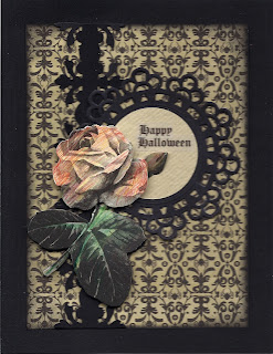
Romantic Halloween #2

I received so many comments on my idea of a "romantic" Halloween card that I just had to make another.


I started with a black card on which I mounted a  piece of texted patterned paper from "K&Company/E.K. Succes" die-cut using the parchment die from "Sizzix" and edged in black ink. I then die-cut one of the many  frames from the Happy Haunting cartridge from "Cricut" out of black paper and textured ivory paper. The 3D roses are again an "Anna Griffin" monochromatic black, grey and white sticker that I lightly colored using chalks. To add that extra layer I added some black tulle behind the roses.  The text is computer generated and printed on a clear "Avery" address label.  Think this one I'll keep and use!

Tuesday, October 11, 2011

Romantic Halloween

Got a lot of request for details and info for my Romantic Halloween card after I posted it on Face Book ... so here goes.

The background patterned paper is from last year's "Martha Stewart/E.K. Success" Halloween pad; which I edged with black ink before mounting it on a black card.  The vertical band was created by double punching a 1 1/4" wide strip of black paper using an "E.K. Success" edge punch.  The medallion was a white die-cut tag from  "Martha Stewart/E.K. Success" which I turned black using a large "Sharpie" marker.  I then cut a circle from rough ivory textured paper to fit inside the medallion.  The rose is a monochromatic  3D sticker in grey, black and white from "Anna Griffin"; which I lightly colored with pencils.  The text is computer generated and printed on an "Avery" clear address label.

Yes, Halloween can be romantic and even sexy!

Monday, October 10, 2011

Mojo Monday Halloween

When I saw this week's Mojo Monday's sketch I knew I wanted to use it and what better way than for one last Halloween card.

The card is a pre-made "Die-cut With a View" scallop edged card covered with two different patterned papers from last yeaqr's "Martha Stewart/E.K. Success" Halloween pad which I edged in black ink.  The ribbon and medallion are done using the "Martha Stewart/E.K. Success" Iron Gate corner and edge punch.  The greyish colored tag is also from  "Martha Stewart/E.K. Success" but I colored the edges with a black marker to maintain the somber theme.  The pumpkin epoxy sticker is from "Creative Imagination" and the text is a left over rub-on from last year's "Target" Halloween collection.  The twine on top is a self adhesive ribbon from a package called "Markings" from "C.R. Gibbons" which I found at our local pet store last year and includes black and tan seld-adhesive suede strips as well.

Friday, October 7, 2011

Elegant Halloween

I like the sharp contrast of black and white cards but find it very hard to use for an everyday card; however I worked the theme into what I consider to be an elegant Halloween card.  I wanted to create an old fashioned  funerary announcement look for this Halloween card. 

To create the card I started by  black embossing a floral medallion stamp (somewhat funerary in look and feel)  from "Inkadinkado". The medallion was cut out and the cut edge was colored with a black "Sharpie" marker. For the background I used the "CuttleBug' Swiss dot embossing folder to create a soft pattern .  To assemble the card I started by mounting the embossed panel on black paper; which was trimmed and in turn mounted to a white card.  Next I ran an "Offray" 1/2" wide black ribbon vertically down the card 1 1/4" away from the folded edge.  I added the embossed floral medallion using thin raised adhesive dots and a black "Offray" bow.  To finish I added a computer generated text printed on an "Avery" clear address label.

Thursday, October 6, 2011

Masculine and Feminine Blank Cards

I was very surprised at one of my early classes when someone asked me what constituted a masculine card versus a feminine card when it came to color, patterns and subject. I came up with a list for each and recently I used my list to create these two cards.

Masculine:
I stamped a Celtic design from "Just for Fun" with "Ranger Archival" sepia ink on a white shimmering piece of vellum paper; which I trimmed and mounted on a metallic copper paper. I created the ribbon by doubling up with a "Martha Stewart/E.K. Success" edge punch on a 1" wide strip of copper paper. To complete the look I added "Stampendous" orange Dot Sparklers faux gems stickers to the stamped panel.


Feminine
I started by cutting a 1" wide strip of gold Swiss dots on white paper from "The Paper Company", mounting it on a piece of gold paper, trimming that and running it vertically down a pink card 1" away from the folded edge.  I edged the card with pink ink.  The roses are a 3D "Anna Griffin" die-cut; which I put together using different thicknesses raised adhesive dots.  To complete the look I added a pink bow also from "Anna Griffin".

Monday, October 3, 2011

Non traditional Halloween cards!

I wanted to make some cards using stamps with crow or raven images but unfortunately I only had one stamp with crows or ravens... so I improvized.

The first card actually uses the one stamp I had with crows or ravens.  The image is a border of crows or ravens on a branch with a moon outline from "Inkadinkado".  To make the card I started by stamping an image of a frame with a bird and some foliage from "Inkadinkado" in black ink on a starry patterned paper from "Frances Meyer". Next I stamped the border image of crows or ravens on a branch with a moon outline in black ink on either side of the first image to create a continuous design. I trimed the stamped image, mounted it on black paper, trimmed it again and then mounted the stamped strip on a blue card. To complete the card I stamped the text from "Serendipity Stamps" in black ink inside the frame .


The second card uses a stamp of two "love" birds sitting on a tree branch from "Stamp Camp" stamped in black ink on more of the starry patterned paper from "Frances Meyer".  I then stamped a moon and cloud outline stamp from "Beeswax" in black ink over the first stamped image. I aligned the images using a stamp positioner to insure that the moon outline framed the two birds. I trimmed the stamped panel in a square shape and mounted it on black paper; which was trimmed and then mounted on a square white card. To complete the card I stamped the text from "Serendipity Stamps" in black ink.


Using black ink and a dark night scape patterned paper turned ordinary birds into Halloween creatures and made for great Halloween cards!