Tuesday, December 25, 2012

Merry Christmas 2012

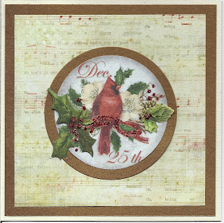
I continued  my theme of red, cardinals and use of scraps with some of my personal cards.


This card started with a left over K&Company/E.K. Success holiday die-cut .... a round cut out featuring a cardinal on a spray of flowers with a simple but appropriate text. The only way to make this image stand out was to make it the central feature of a square card, so I did. I layered a piece of antique gold paper from The Paper Company on a 5 1/2" x 5 1/2" white card over which I layered a piece of music sheet patterned paper from My Mind's Eye Signature Christmas pad. Using Spellbinders cricle dies I cut out the image and then cut out a piece of antique gold paper slightly larger to frame the image and centered them on the card. To add some depth I used a couple of 3D holy leaf stickers from K&Company/E.K. Success and then using a red Stickle from Ranger I highlighted the ribbon and some of the berries.
 
Merry Christmas.
Sunday, December 16, 2012

Christmas left overs

Every year I use the Holiday season to go through my left overs from years past and see whether or not I get inspired and can do something with them. This year I got lucky.


I started with a small piece of Graphics 45; which I cut using a deckle edged scissor from Fiskars. To that I added a smaller piece foiled texted paper from Basic Grey. I  embellished the papers with a K&Company 3D glittered ornament sticker and a 3D Design Studio texted sticker.

Saturday, December 8, 2012

Christmas Inspiration

Each year I'm flattered because I'm asked to post cards early for inspiration and as examples. Making cards is second nature to me and I'm only to happy to share my ideas. For each Holiday I try to pick several theme images and do several different cards using these images. For Christmas this year I wanted to use a lot of red: so I picked cardinals.

The  first card uses an old green rhinestone 3D frame and a very intricate 3D cardinal sticker with flowers and text. Just two stickers simply layered can look very beautiful.


The second card has several stickers and a simple strip of red paper layered together to create the final image. I started with the epoxy Christmas ornament sticker to which I added a second sprig of ivy at the top. I connected the ornament to the top of the card using a strip of red paper. Then I added a cardinal sticker over the top of all of them. The text is a gold sticker that I colored with a red marker.


The third card, like the second one, has several stickers and a simple strip of red paper layered together to create the final image and the basic design is the same as before as well. Start with a wreath and then use a strip of red paper to connect it to the top of the card.  To add to the 3D effect I added several small epoxy flower stickers to the wreath. I finished the design with another cardinal sticker and red colored text.


Simple is sometimes better and a bright splash of contrast can work wonder to draw the eye to the image ... which nature always provides perfect examples of, in this case: the cardinal!

Sunday, November 25, 2012

Golden Wreath

While shopping I saw a beautiful card of a gold wreath ... for $8.00! I knew I could do something very similar for a whole lot less.


The card is a shimmering white paper from Bazzill Basics. The wreath is made up of three layers: The first layer is a circle made up of gold leaf sequins from Darice, the second layer is made up of gold foil paper from Hot off the Press that I punched with a pine branch hand punch from Mc Gill and the final layer are the golden faux gems stickers from Stampendous. I added a gold bow from Anna Griffin to complete the wreath and a gold text from Richard Marks to complete the card.
 
The papers, the bow, the faux gem stickers and the punch I already had. The sequins and the text sticker I had to buy. Even if I had to buy everything ... and yes that would have cost maybe more than the original card, I could make at least four (maybe even five) cards with the supplies. Plus I can also add "I made it myself!" and that's priceless.

Saturday, November 17, 2012

Thanksgiving sunshine!

This year for Thanksgiving I decided to send out sunshine in the form of cards with sunflower images. Both cards were made with the same stickers: 3D vellum sunflowers from Jolee's Boutique/E.K. Success and glittered rub - on green flourishes from E.K. Success, what changes are the backgrounds.
 
The first card uses a simple dark brown panel cut out with a deckle edge scissor from Fiskars on a tan colored card. The second cards uses an embossed frame image from Tim Holtz/Sizzix in chocolate brown mounted with the center having been cut out using a Spellbinder oval die.on a simple white card.


Hopefully these will brighten the day of whoever receives them!

Saturday, November 10, 2012

Layered Flower Garden

Sometimes I just make a card without a reason or occasion ...


This card is such a card. I was cleaning out my stickers and found several sheets with only one or two pieces left on them ... so I decided to put them together.  I started with a size A2 white card and a light blue die cut oval as a background. Then I added a garden scene sticker (Jolee's boutique/E.K. Success); which I embellished using individual flowers cut from a larger flower arrangement (Sandylion) and a couple of tulips (Martha Stewart/E.K. Success). To finish it off I added a text strip (K&Company/E.K. Success).


Friday, October 19, 2012

Halloween Trees!

Scarry trees have been used since Disney's "Snow White" and of course "the Wizzard of Oz" ... so I decided to use them for some of my Halloween cards.
 
The first card was made using a 3D tree in a graveyard sticker from WalMart on a piece of patterned paper from Basic Grey edged in black. The moon was punched from a piece of orange paper and also edged in black. The witch, angled tree and text are all rub-ons from an old package from Target.


The second card started with a white window card with an embossed frame from DCWV. I covered the embossed frame with strips of black. The inside of the frame/window highlights a patterned paper from DCWV. I added three laser cut tree stickers from Jolee's Boutique/E. K. Success around the framed window. Because the trees covered the opening of the window and I didn't want them to stick to the background I used an old trick ... I put talcum powder of the portions of the sticker I did not want to stick. The text is a rub-on from Heidi Grace.


The third card makes use of a patterned paper from DCWV mounted on a shimmering black card made using Bazzill Basics paper.The tag was made using a CuttleBug cut and emboss folder on white paper which was then colored with black and silver ink. The text is computer generated. The card was then embellished with glittering bats from Martha Stewart/E. K. Success.


OK, so they aren't that scary but they are still pretty cool!

Sunday, October 14, 2012

Finally ... some themed Masculine Cards!

Yes, once again it took someone to remind me that I really hadn't made any masculine cards for a while. Having no special occasion in mind, I made three generic blank cards.
 
The first card is a pocket card. The pocket came in a package of four from K&Company/E.K. Success. the card background was made using Papyrus wrapping paper edged with brown ink from Ink It up!. I create a belt from a different piece of Papyrus wrapping paper and added a copper buckle from Making Memories to hold the pocket portion of the card in place. The top of the pocket had a scalloped detail that I simply cut off. Before adding the pocket to the card, I edged it with brown ink. The tag pulls out and using a Hero Art stamp I added the words "You make me smile" on it in brown ink. 
 
The second card was made using a texted paper (source unknown) panel on a brown card. I used matching brown paper and a Cuttle Bug die and embossing plate to create a tag, over which I added a 3B hard resin sticker of a pocket watch by Jolee's Boutique/E.K. Success. The chain for the watch is a gold border sticker from Starform.
 

The third card started with a brown card over which I laid a die cut frame from the new David Tuterro series at Jo Ann's Fabric. I started by coloring the white die-cut silver using a Deco Color pen and then added depth and texture in a gun metal grey finish by covering the entire piece with Perfect Pearl/PearlX powders. Before adding the colored die-cut to the card I cut out the center portion and added a patterned paper from 7 Gypsies. To finish the card I added a 3D hard resin sticker of a crest by Jolee's Boutique/E.K. Success and four burgundy colored pearls in the corners.


Each card as space to add any appropriate text or can actually be used as is.

Saturday, October 6, 2012

Non traditional Halloween cards!

Sometimes non-traditional images work best. Last year I concentrated on "romantic" Halloween themed cards, this year I was into fanciful frames.
 
The first card was actually the inspiration for all the other. The fanciful frame with silhouette and banner is actually a piece of paper from Martha Stewart/E.K Success from last years. All I did was add the rub-on text from Heidi Grace and mounting them on alternate layers of black and ivory paper.


The second card uses a Spellbinder cut frame and some black flower stickers from Recollections with an infill paper from Martha Stewart/E.K. Success and a rub-on text from Heidi Grace. The card was made from orange paper edged and aged with black ink.


The Third card uses a black glittered frame cut using the Cricut Halloween cartridge. The ribbon was create using a punch from Martha Stewart/E.K. Success also cut from black glittered paper. Once again the black flower stickers are from Recollections and a rub-on text from Heidi Grace. The card was made from red paper edged and aged with black ink.


The fourth card was made using a Spellbinder scalloped oval pattern die-cut frame infilled with alternating black and white patterned paper, black and white insets. The 3D flower stickers are from Anna Griffin and colored lightly with pencils. The final touches are a computer generated text and an Offray black bow.

Sunday, September 16, 2012

Monochromatic 3D card

While cleaning out my supplies I came across some paper and stickers that seemed made for each other ... the fact that they were all made by the same company but over a period of a couple of years probably didn't hurt. So I couldn't wait to get started.


All the products are from K&Company/E.K. Success. The background paper was actually a large die-cut tag from which I cut out the center portion. The background tag was one of several designs within a package but I lengthened it by cutting it in half and hiding the separation with the next layer of stickers. I combined three separate 3D lightly glittered iris stickers to create the central bouquet. The bow was a last minute addition (I think that it is actually from Offray) but it seemed to finish off the overall image..

Saturday, September 8, 2012

Bargain stickers!

Last week-end I got a whole lot of stuff of clearance and of course when I got home my reaction was "what was I thinking" when I looked at some of my new treasures. So I challenged myself to come up with something different.


The 3D rhinestone embellished flowers reminded me for whatever reason of exotic Moroccan tiles, so I made the background using one of my Spellbinders dies from an old K&Company/E.K. Success paper that had a very dark contrasting color. When I went to add the flowers, the stems were in the way ... so I cut them off in pieces and after I had the flowers located where I wanted them I added the pieces of stem back around them. The finishing touch: a glittered sticker text. Works for me!

Saturday, August 25, 2012

Retro Cards!

Sometimes going back in time can be fun! I found these great wooden buttons at Wal-Mart and couldn't wait to use then in cards.
 
The first card uses a wooden "peace" button as the inspiration for the theme, the color scheme and even the circular design motif. The card is a pre-made embossed off-white card from Cramer & Company, which I embellished with a retro patterned paper from Die Cut with a View and a matching border from Mrs. Grossman's Design Lines. To add another layer I used a second epoxy button that picked up some of the colors from the "peace" button and brought in some new ones as well. To finish teh card I used a variety of epoxy button stickers and rhinestones.


The second card uses another wooden "peace" button. Again I played up the circular theme and the colors from the button but in a totally different manner. I started with a 5"x5" white card which I edged with some Mrs. Grossman's Design Lines. The solid color circles are rub-ons from American Traditions and the intertwined multi colored circles are stickers from Stickopotamus/E.K. Success. The finale touch was the addition of an appropriate text in the form of a sticker from Mrs. Grossman's.


Saturday, August 18, 2012

One for the Boys!

Learning a new trick is always great, especially if it's one that can add another dimension to your cards. That is why I like the partial embossing technique ... this allows me to create an unembossed area for text!


The back ground (even though it's a little hard to see in this scan) was made using the "star" embossing folder from CutleBug. I started by placing my white paper in the bottom half of the embossing folder and then running it through the embossing machine. Then I turned the paper 180 degrees and embossed the upper third. of the paper. This left a flat unembossed space in the embossing to work with. In this case I used a glittered text sticker to compliment the glittered 3D sticker.

I noticed that I'm not the only one who likes flat spaces inside the embossed background ... Tim Holtz has come out with templates to be used to create oval spaces ... but why spend the money when you can make your own!

Wednesday, August 1, 2012

Special Birthday

I love making special cards celebrating special occasions for special friends. Here's the latest birthday card I made for one of my FaceBook friends.


I wanted the card to be bright and happy (like the recipient) ... so I started with a rhinestone bird fabric sticker from Jolee's Boutique/E.K. Success. Then came the hard part, finding items that worked with this colorful image. I started with the background paper; which turns out to be the packing paper for K&Company/E.K. Success stickers. I liked the multi colored background with the random polka dot pattern. Then I used my Spellbinders to die-cut an appropriately fanciful tag/frame. To add to the card I used the remaining glittered rhinestone epoxy stickers that came in the package with the bird sticker. Of course I cut those up and re-arranged them to suit my needs. The text is another sticker from Mrs. Grossman's.  Hope you like it ... I know she did!

Sunday, July 22, 2012

Monochromatic Multi Layered Cards

Combining all the different die-cut, embossing and punches one has into a single card can be quite challenging but also very rewarding. When I recently saw some beautiful examples on Pinterest as well as posted on face book by Sheryl I just knew that I had to try this technique.

When I finished my first card I realized that I'd missed the boat!  The solid color background paper I used, although embossed, just wasn't right and took away from the rest of the layers. 


So I tried again and again.Finally I got the hang of it and the next three cards came out much better.


Each one followed the same basic principal and was made entirely out of white paper.  The background was embossed using  a "CuttleBug" folder and then lightly colored with an ink pad to set the color scheme for the rest of the card.  The next layer  is a panel which was created using one of my many "Spellbinder" die-set.  Each die-cut panel was embellished by either a ribbon or an arrangement of flowers; which were either done using a punch ("Martha Stewart") or another die-cut system ("Sizzix").  On the first card I also added a teddy bear and three hearts; which were punched out using a mini Michael's punch.  For my color schemes I selected: black for the first one, lime green for the second one and gold for the third one. 

These cards are fun to make but do require a lot of patience. Good luck making yours and can't wait to see them.

Wednesday, July 18, 2012

All occassion blank card

As much as I like framing my images on my cards and creating scenes I also like to cut up my stickers to make them fit the overall design and size of the card.


The card's background was made using two shades of blue  to match the color of the one large Pansy which were cut using a Spellbinder die set.  The flowers are a dollar store find and are made up of several 3D glittered and rhinestone covered stickers from one package. Some of the stickers I cut apart and re-assembled to create a fuller look (such as the flowers on the lower right portion) while others I trimmed to give a more specific shape (like the flowers in the pitcher) and then I used the trimmed off flowers to create an even deeper 3D look by adding them on top of another layer.

Although it's a lot of detailed work, cutting up and trimming stickers is made easier if you lay the sticker on wax paper and use a very sharp Exacto knife (scissors tend to flatten the 3D stickers). You'd be surprised how much you can do to a sticker!

Saturday, July 14, 2012

Masculine Birthday

Masculine cards are always a challenge but I found that anything "regal" works well: case in point an old fashioned looking coat of arms.


The card background was made using the Script Embossing folder from CuttleBug which I lightly colored with gold in and then layered on gold and dark brown paper. The coat of arms was done using antique gold paper from The Paper Company and the Spellbinder dies from the Heraldry set.  I embellished the crest with some Jolee's by You leafy branches and single flower. The ribbon is an old one from K&Company. The test is from Mrs. Grossman.

How much more manly can you get but to remind him that he is "king" of his own little world!

Monday, July 2, 2012

4th of July Celebration!

I enjoy creating what I call "scenery"cards and wanted to make one for the 4th of July. In thinking about ways the 4th of July is celebrated I saw the old photographs of fireworks over amusement parks and so I decided to create my own version.


I started with, of course, a selection of Mrs. Grossman's stickers. Using a soft purple background I created an amusement park from various "retired" packs of stickers and added the shimering firework bursts.  To make the card trully scenic I used a legal size card and ran a band of multi colored glittered paper from Martha Stewart/E.K. Success across the lower portion. Then to stretch the image I cut it up in three pieces and mounted the pieces on a piece of glittered yellow paper from Die Cut with a View.

Maybe this is not your typical patriotic themed 4th of July card but it does celebrate an all American creation: the amusement park! Happy 4th of July!

Saturday, June 23, 2012

More today ...

Made this card to let my partner know how I feel about us ... after 19 years the magic is still there and with all the changes coming in our lives it will sorely be tested.


The card itself a a pre-made card from a pack of "Die Cut with a View" I got a couple of years ago; which I edged in brown ink. The die cut tag and rosette were made using "Spellbinders" dies and then using the dies as masks stenciling in color. The 3D glittered flower is an old design from "K&Company" and the text is a rub-on from one of the old "Die Cut with a View" card quote packs.

Monday, June 18, 2012

Mojo Monday #246

It was one of those sketches that immediately called out to me - another masculine layout!


Layers of different shades of brown make up the background, including a strip of paper ribbon from "7 Gypsies".  The "Hero Art" text are stamped in "Color Box" fluid chestnut roan ink using a stamp postioner to get the text centered on the small squares. The 3D flocked teddy bears are from "Sandylion".

Okay so the card is not exactly he man masculine, but it will work for your favorite little boy no matter what age he is!

Sunday, June 17, 2012

Fake glitter!

I'm not one to use much glitter on my cards mainly due to the mess it creates when using it! Over the years I've tried different products from actual glitter to glitter glue and decided that if I was to use glitter I would use the Martha Stewart/E.K. Success glitter markers. This worked well for me until  I became aware of the Ranger/Tim Holtz glitter glue called "stickels". Although it's been on the market for a while (I actually got a holiday set a couple of years ago which I never used) I only recently decided to give it another try and WOW ...  I was hooked! The very small tips are perfect for details while the colors are all over the spectrum.


The scallop and oval were cut using Spellbinders dies from green and white paper; however before I die-cut the white oval I  place a rub-on floral design from American Traditional.  I embellished the flowers using the Stickels glitter glue in diamond (white), gold, blue and purple. Although the combination is hard to see on this scan, the actual product look very good because it really makes the flowers pop from the background.  To finish I threaded a purple ribbon through the scalloped background and then adhered everything to a white background; which i trimmed and then adhered to a white card.

Thursday, June 7, 2012

Father's Day

This year I decided on simple cards by using simple images in a monochromatic scheme.


The cards were inspired by a 12' x 12" sheet of Graphics 45 paper with vintage car images.  I matched the background colors to the color of the cars, as well as the overall theme.  These are simple and easy, yet perfect for any man.

Friday, June 1, 2012

Simple sticker scenes

I've been making "scenes" using stickers for a long time but recently have expanded the idea to create more impressive scenes by adding a second scene outside the outlines of the first one.  Here are some examples.


All the stickers used in the creation of the background of these scenes are old "Design Lines from Mrs. Grossman's" or the smaller "Sticko/E.K. Success" stickers. I start creating the scene by using various stickers and overlapping them from the smallest in the far distance to the larger nearer to the front of the scene on a larger piece of paper. I then cut out the best part of the scene by using either an oval or round die from "Spellbinders". Once the scene is located on the card and to finish the card I create further depth by adding stickers to create a second scene extending from beyond the basic outline of the first one.

Friday, May 25, 2012

Peaceful Reflection

Just wanted to wish everyone a peaceful, quiet and happy Memorial Day week-end.


The stamp is from the UK (I have to look up the company) and the technique used was simple mirror stamping done in black ink on patterned paper. To add to the effect I colored the lower portion lightly using coloring pencil. It's one of my favorite serene scene and I hope it evokes quiet times to all.

Monday, May 21, 2012

Mojo Monday #242 - Masculine

Here's the masculine counterpart to the Mojo Monday 3242 challenge.

The 4 1/4" x 5 1/2" ivory card is covered with brown paper and then a layer of embossed patterned paper from K&Company (pre-E.K. Success). The ribbon is made from a 1 1/16" wide piece of brown paper punched on both sides with a Martha Stewart/E.K. Success edge punch. The larger tag is made from a piece of texted paper from Die Cut with a View edged in brown ink. The smaller tag is a pre-made tag (from which i cut off the borders) from Colorbok. The gold metallic sticker leaves are from Stampendous. The square brad is from Making Memories and is embellished with a square gold rhinestone from Mark Richards.

Again the tags were left blank for future text.

Mojo Monday #242 - Feminine

The sketch this week was perfect for my style and I couldn't resist making both a feminine and a masculine version of the cards.


The card is ivory (4 1/4" x 5 1/2") covered with a pink damask paper from Anna Griffin; which I edged with copper sliver lines from Mrs. Grosman's. The ribbon across the card is from Jolee's Boutique/E.K. Success and is overlaid with a glittered scroll design from recollections. The larger background tag is ivory paper edged with more of Mrs. Grossman's copper sliver lines while the smaller tag is a pre-made tag (from which I cut off the borders) from Colorbok.  The 3D glittered flowers are from K&Company/E.K. Success. The glittered butterflies are from Jolee's Boutique/E.K. Success.

The tags were left blank for future text.

Monday, May 14, 2012

Frame making

I enjoy framing my images on my cards and have been making my own frames using a combination of CuttleBug embossing folders with Spellbinder dies.


Start by embossing a white piece of paper in one of the many frame embossing folders from CuttleBug. Trim the embossed paper and then using an appropriate die cut from Spellbinders, cut and emboss a central opening.

I used a white core piece of white paper, but by using a white core colored paper and lightly sanding down the raised portion of the frame the results are totally different ... or use the debossed side versus the embossed side. Instead of sanding the embossed portion, color it with ink. Simple, easy and very effective.

Saturday, May 12, 2012

Cameo card

Inspiration always comes to me when I go to a craft store and see the prices they charge for some of the products. Case in point: cameos! I saw a new package of cameos and small jewelry pieces (fake of course) by a leading manufacturer and was saddened by the almost five dollar price ... so I decided to  make my own cameo.


The cameo was made using the "Heritage" Cricut cartridge and the oval and scalloped oval Spellbinders dies. Yes, if I didn't have those items it would have been easier to spend the money for the jewelry but I had them so why not use them! A layer of gold paper embellished with some gold corners from Starform, the Spellbinders die-cut pieces layered from white to pink and finally the profile image in white and there you have it -  a cameo!

I finished the card off by using a pastel pink damask paper from Anna Griffin, edged with gold lines and a few glittered 3D flowers from K&Company/E.K. Success. All the card needs is an appropriate text.

Sunday, May 6, 2012

Good Luck - Oriental Style

Sometimes a simple idea can turn out to be the most complicated one to actually bring to life. case in point: using a beautiful image of dragonflies with a simple text of wishing someone good luck.


The dragonfly image stamp (Stamp Camp) is one I've had for a while and have tried several times to use but without good results. I finally focused on another part of the image: the bubbles. Once I did this the card came togather very easily. The image was stamped in black ink on plain white paper and colored with both regular markers (Sharpie) and glitter markers (Martha Stewart/E.K. Success). Fot teh card itself I chose a green paper matching the color I used for the dragonflies bodies. To highlight the bubbles I recreated them on a larger scale using self adhesive white vellum. The text is a silver sticker from Stampendous.

Friday, April 27, 2012

Macsuline Die-cut Cards

I've decided that I can not buy anything new and so I've been really busy playing around with things I already have ... such as my many, many Spellbinder dies. I also decided to try and make a couple of really masculine themed cards using the dies. Here are the results.


The first card starts off with a gold background die-cut and embossed using the largest of the Fleur-de-Lis rectangle die. I fitted the inside of with a patterned light colored patterned paper (the backing from one of my K&Company/E.K. Success sticker sheets). Next I added the central gold medallion which was die-cut and embossed using one of the Fleur-de-Lis accent dies. I added a die-cut and embossed red heart made using the Renaissance Hearts die.The two lions are done using the Heraldry dies. The 3D banner was made using one of the Ribbon Banner dies. The banner was cut apart, edged with black ink and then reassembled using raised adhesive dots. The banner is the perfect place for a future text.

The second card started by making a 5 1/2" x 5 1/2" square white card. Using the Martha Stewart/E.K. Success around the page Scroll Lace punch I create the next layer from a square of ivory paper; which I lightly edged with gold ink. Then using two die-cut and embossed gold tags from the Fancy Tag Three series of dies I created the central medallion by criss-crossing the two cut out tags on a diagonal. The crest from the Heraldry die set was die-cut, embossed and then colored with markers before it was added to the center of the card. The banner is made using the Sizzix Tim Holtz Alterations Tattered Banners die. I edged the banner with gold ink, folded back the ends and then added it to the card using raised adhesive dots. To add some bling I used large and small red rhinestone hearts from Darice. Again the banner is the perfect place for a future text.

These cards required a lot of patience and a lot of work ... but I think they were well worth it!

Monday, April 23, 2012

Oldie Moldie monday

I reluctantly used a small piece of this ancient K&Company (before they joined with E.K. Success) Tulip Embossed paper, which I edged with coffee bean ink from Inkadinkado and embellished with cut outs using the Spellbinders Fancy Labels dies also edged with coffee bean ink and some Jolee's By You/E.K. Success tulip sticker which I aged to match the paper using more of the coffee bean ink. The text is from Starform.